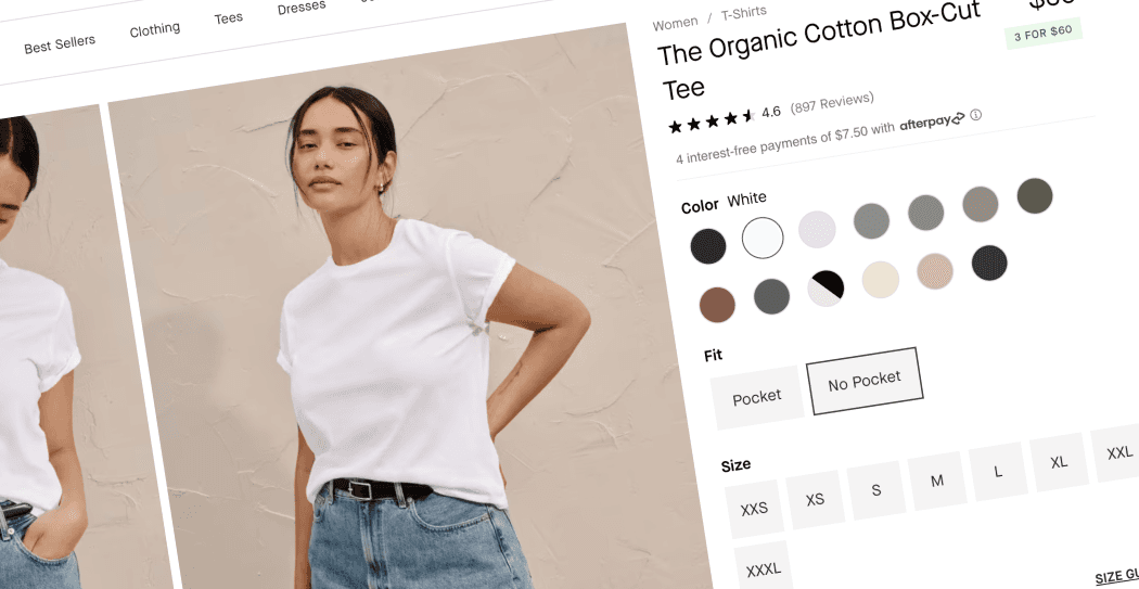
5 PDP Features To Inspire Your Next Redesign
The PDP, or product detail/description page, is arguably one of THE most important pages on your e-commerce site. It is the digital equivalent of a customer picking up a product in-store, examining it closely and determining whether they want to buy.
Over my last 7+ years designing for e-commerce brands, I have seen firsthand how the right PDP design, layout and content can skyrocket conversions.
Let’s dive into five PDP features being used by brands right now that can get your wheels spinning and inspire your next redesign.
1. Dynamic Dual Image Display
What to do:
Consider implementing a dual image layout that changes dynamically when a variant is selected. Not only is this a great use of the space above the fold, but this immediately allows the customer to see how the product looks and/or interacts with the customer.
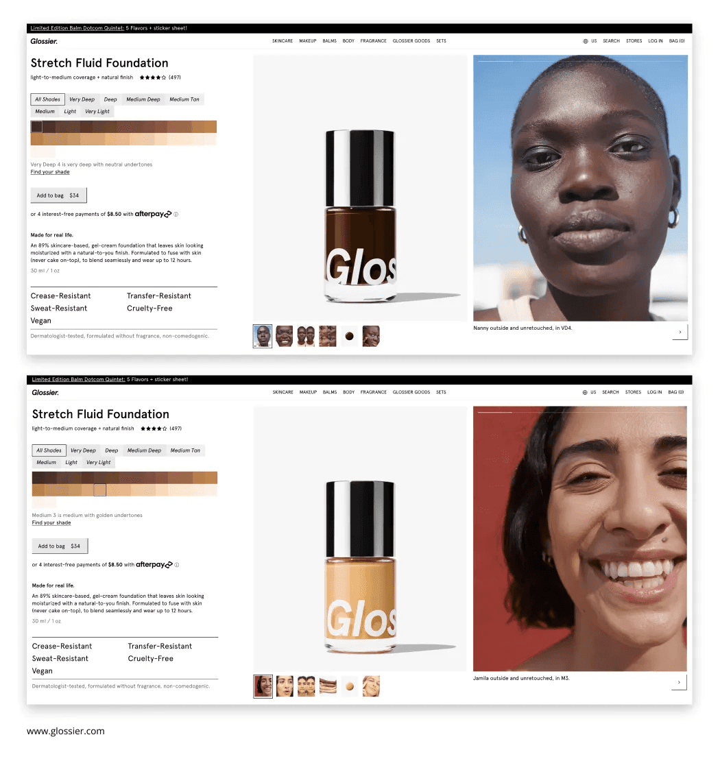
Glossier’s PDP features this innovative approach that is cropping up more and more on e-commerce sites determined to give a clean way to display more visual information from the get-go. In Glossier’s case, this not only shows the product and current shade selected, but also a matching model image for that shade and immediately shows how it looks and sits on the skin. Customers can right away make informed decisions in selecting their shades and see humans just like them wearing the product.
Implementation notes:
When testing out this layout and design, it is very important to not overwhelm the page with too many images in the carousel. This can clutter the page, make the solution hard to manage and cause confusion for the customer if they don’t know where to look. Keep it clean, concise and reserved for only relevant visuals. Glossier’s example shows how to keep imagery minimal and even keep the same order of images for each variant!
2. Unified Variant Selectors
What to do:
Have two products that are exactly the same except for one small feature? Consider combining these PDPs into one, treating design variations as just another selection alongside size and color.
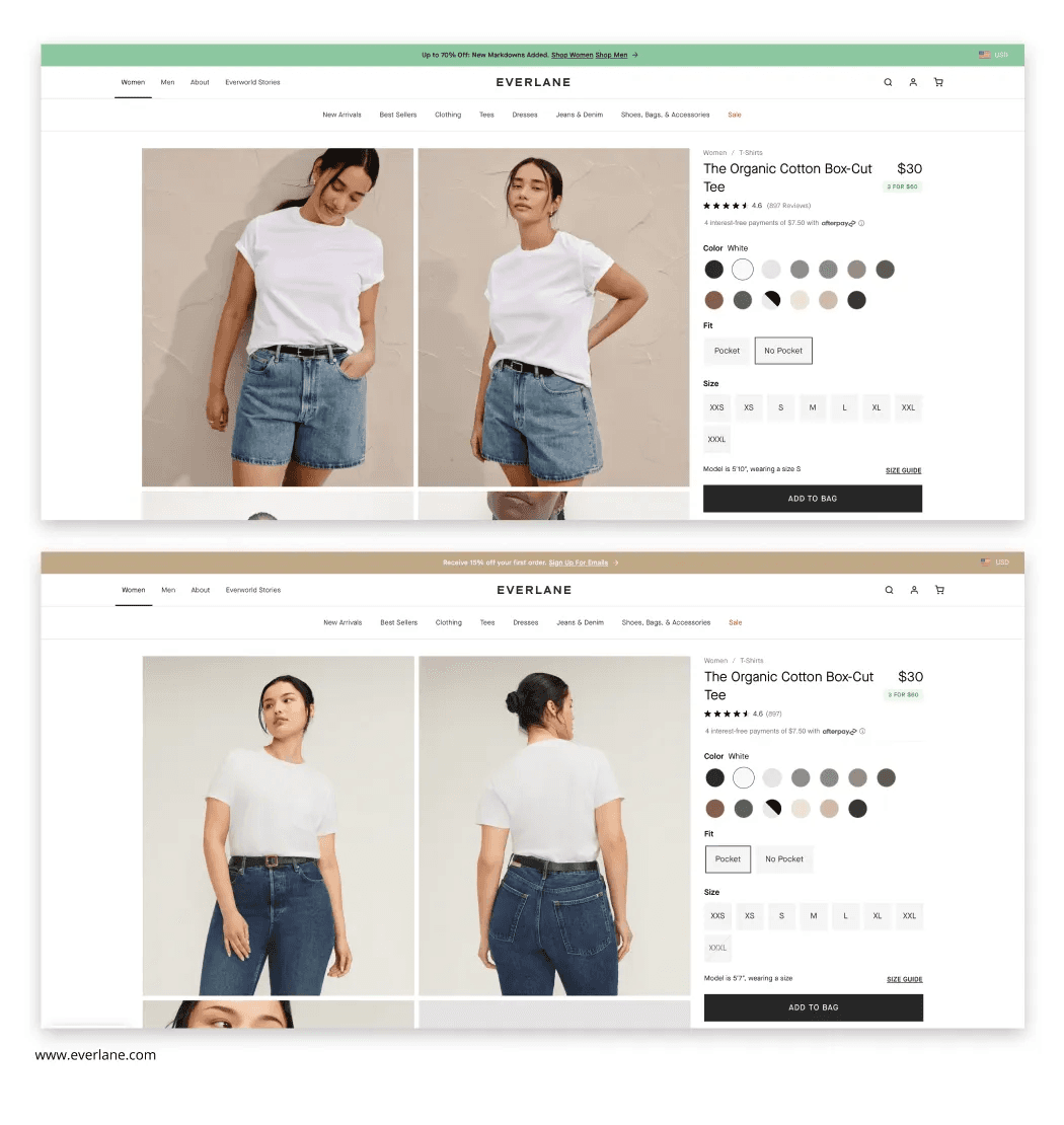
Everlane’s Organic Cotton Box-Cut Tee comes in two variations — one with a pocket and one without. Alongside the multiple color variations and size choices, they added in a “Fit” selector to feature these Pocket and No Pocket variants. This streamlines the shopping experience and has a potential chance at a higher chance of AOV as customers may have not even realized that other versions exist!
Implementation notes:
Make sure to avoid cluttering these zones if there are too many options available. The Everlane example works well as they only have two variations to add — keep the variant selector zones intuitive and still easy to navigate. While it’s a great idea to combine these PDP listings, it’s also important to remember to offer them as separate products in the product collections.
3. Cross-Category Recommendations
What to do:
Try implementing a clean and well-designed “Recommended products” zone that suggests complementary items from different product categories.
Baymard Institute found that, “Once users have identified an item they intend to purchase, they often have an interest in viewing other products that complement that product. As observed during testing, participants were quickly disappointed and frustrated when desired supplementary products were difficult to locate. Without ready access to relevant supplementary products, users are more likely to proceed to purchase without them, or wander off-site in search of them, and potentially not return.”
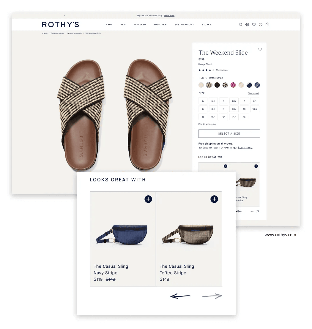
Rothy’s PDP design for these sandals are a great example of putting this feature to use. Rothy’s features recommendations for accessories and bags that could complement the selected shoes, helping customers “complete the look”! This zone wouldn’t hit the same way with recommendations for more random shoes.
Implementation notes:
Keep in mind when implementing this feature — you must ensure your recommendations are truly complementary to the product they are viewing. These have a higher chance of converting!
4. Home or Virtual Try-On Features
What to do:
If you have a product that people might need to try on before they purchase, incorporating a Home or Virutal Try-On Program into their PDP’s could be the ticket! This solution requires a lot more heavy lifting from an implementation stand-point — but your outcome may be a great experience for your customer and a higher chance of conversion!
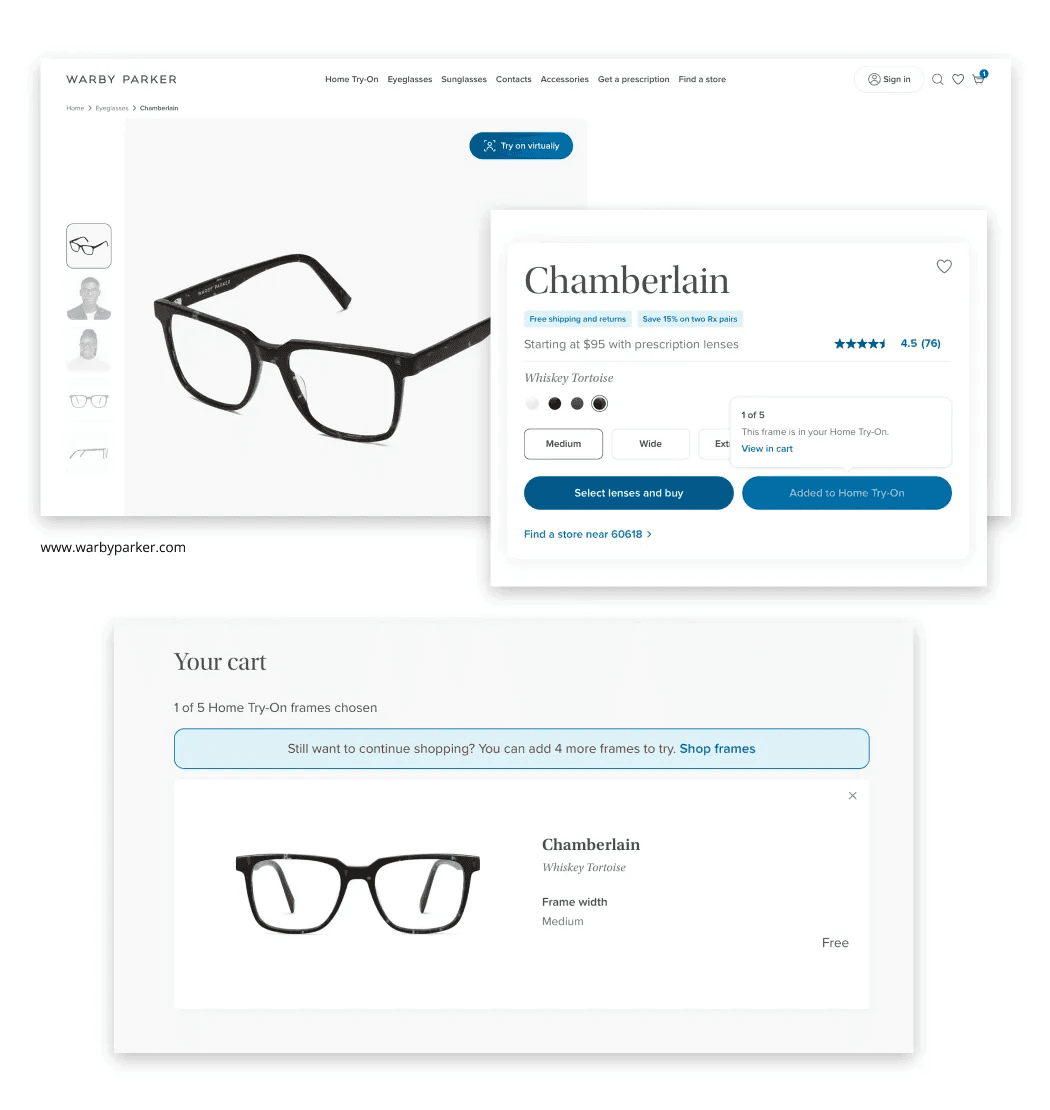
Warby Parker, the innovative eyeglasses company, incorporates both a Home and Virutal Try-On Program. Glasses are a very personal purchase and people can make a quick decision if they like them or not if they try them on. Warby Parker takes that in-store experience and makes it come to life in the digital world. The feature is prominently displayed on their PDP, has a collection clearly marked in their navigation for glasses that be tried on at home and it’s seamlessly incorporated into their cart experience. An A++ experience!
Implementation notes:
When it comes to virtual try-on programs, these work especially well for products like glasses and accessories — products that don’t change or adjust too much depending on lighting or your physical location. Things can get inappropriate and downright incorrect really fast when it comes to products like makeup that rely on matching skin tones. Virtual try-on programs that use live video/photos depend entirely on perfect lighting conditions to get perfect matches, so its best to tread carefully for products like foundation. If implementing, make sure the customer journey is well thought through and if any further explanation is needed to ensure a smooth experience.
5. Interactive 360-degree Product Views
What to do:
If you are looking for something to really set you apart, especially when selling products that rely heavily on dimensions (like couches) or have a front and back (clothing) etc, check out 360-degree product views! This feature is another way to emulate the in-store experience, where a customer can interact with the product in a more intimate way. Videos are already known to be an incredible way to immerse the customer in with your product — this takes it a step further!
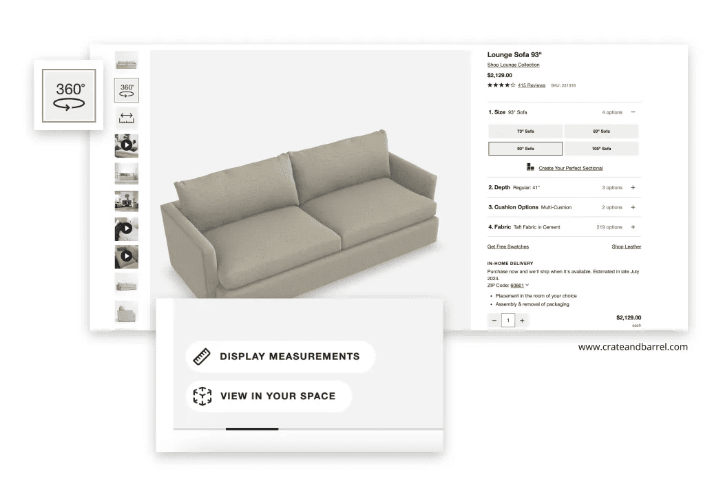
Crate & Barrel has successfully implemented this feature on their site, where customers can zoom in and spin couches around to view all angles. To make this even more immersive, they have also integrated one of the most important aspects of couch buying — dimensions — into the 3D model! To finally top it off, they also allow you to place this 3D rendering in your space using AR on your phone. All of these features make it as easy as possible to feel good about your purchase online.
Implementation notes:
While this is also a feature that requires a bit of an investment, this can definitely set you apart in the e-commerce space. My biggest note — make sure to use this feature where it makes the most sense. While it can work within the main product image carousel (like the example above), you don’t need to limit 360-degree views to this area alone. This feature can also work well below the fold in your additional content zones. Make sure these are high-quality and not “glitchy” as it can drastically detract from the experience!
Conclusion
As always, the key to a successful PDP is understanding your specific audience and your products! What works for brands like the above might not work for another. Get to know your audience and see what they are needing, looking and searching for. Always A/B test new features and listen to what your customers need — they will tell you if it is successful or not!
I hope these PDP ideas have inspired you to think about your own PDP! Let me know if you found any of it useful or have any other cool examples you have seen out in the wild.
Happy growing,
Christine Walsh
👋 Hi, I'm Christine!
I’m a Chicago-based UX/UI and digital design pro who lives to help brands reach their full potential! Beyond that, I'm also a travel-loving, equestrian, cat mom who has a strong love of tea and good books. Now that we got the introductions out of the way, I’d love to chat with you about your brand’s needs and how we can work together!

