A Blissful Website Refresh
When AS Beauty acquired the Bliss brand, I helped quickly redesign the site to shift over to Shopify. This created a branded, simplified experience for customers as well as give the company a central place for content management.

The Challenge
Redesign the Bliss Skincare website to comply with a shift
With the acquisition of Bliss and a quick need to shift over to the Shopify platform, there was an opportunity to simplify the branding without losing it's primary identity.
The Result
A smooth transition to Shopify with a simplified, branded experience and digital presence
The redesign helped create visual balance, ultimately providing a simpler, more user-friendly experience, allowing both the product and its story to shine.
The Homepage
Branding Challenges
When assessing the existing pages for a rebrand, I quickly identified the need for simplification. The use of gradients felt arbitrary and lacked any connection to storytelling or product. Limited whitespace made the color feel overwhelming. Instead, I aimed for cohesive color stories tied to product narratives and leveraging vibrant photography, especially showcasing diverse models for this skincare brand.
UX/UI Improvements
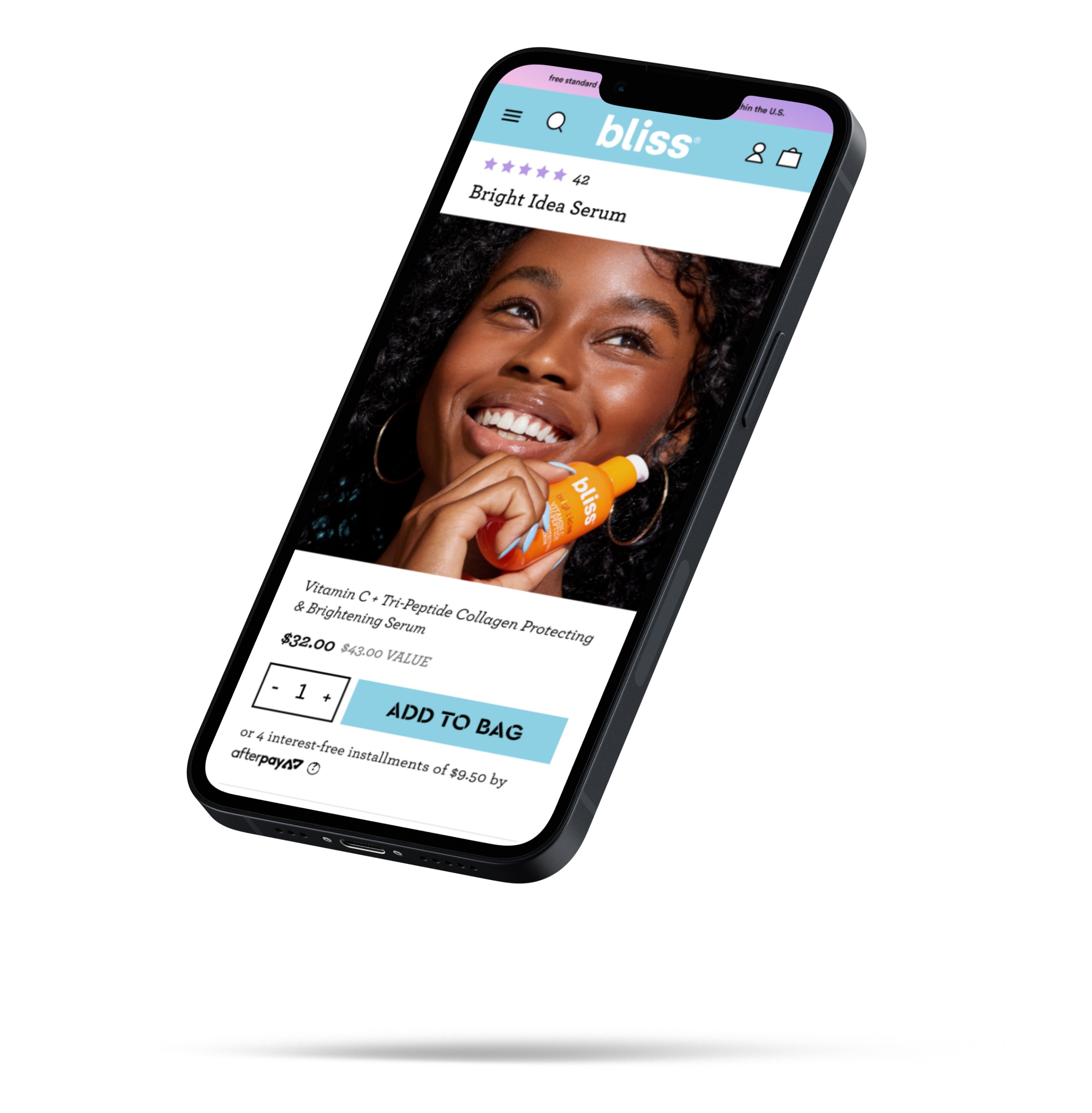
There were several ADA Compliance gaps, especially with body copy (Note the famous "Bliss blue" on white!). Many pages felt random and confusing, prompting simplification for clear messaging. Most notably on mobile, small text sizes were increased for better readability. Button sizes were augmented, and visual carousels with peeking imagery were introduced for a more engaging experience for customers.

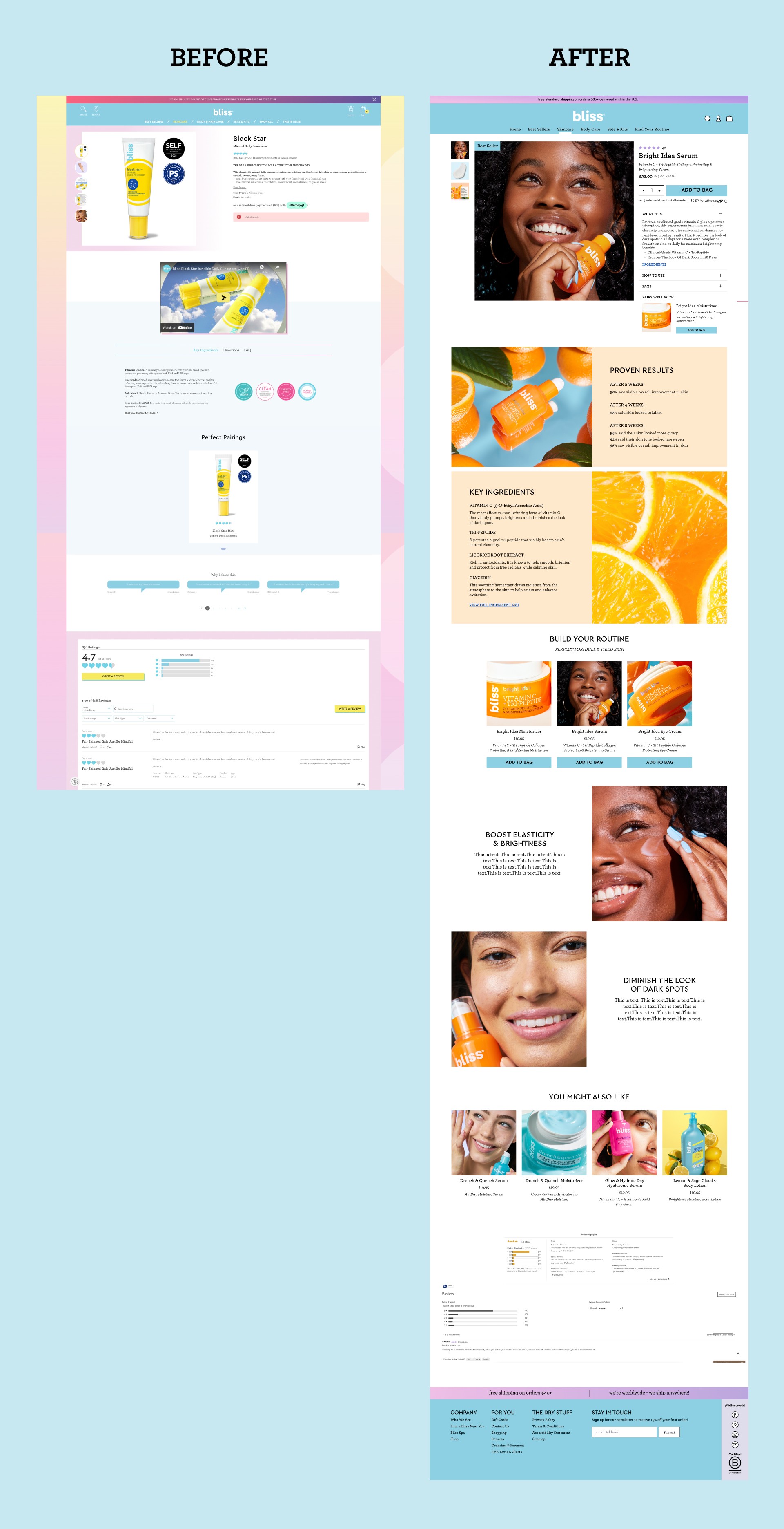
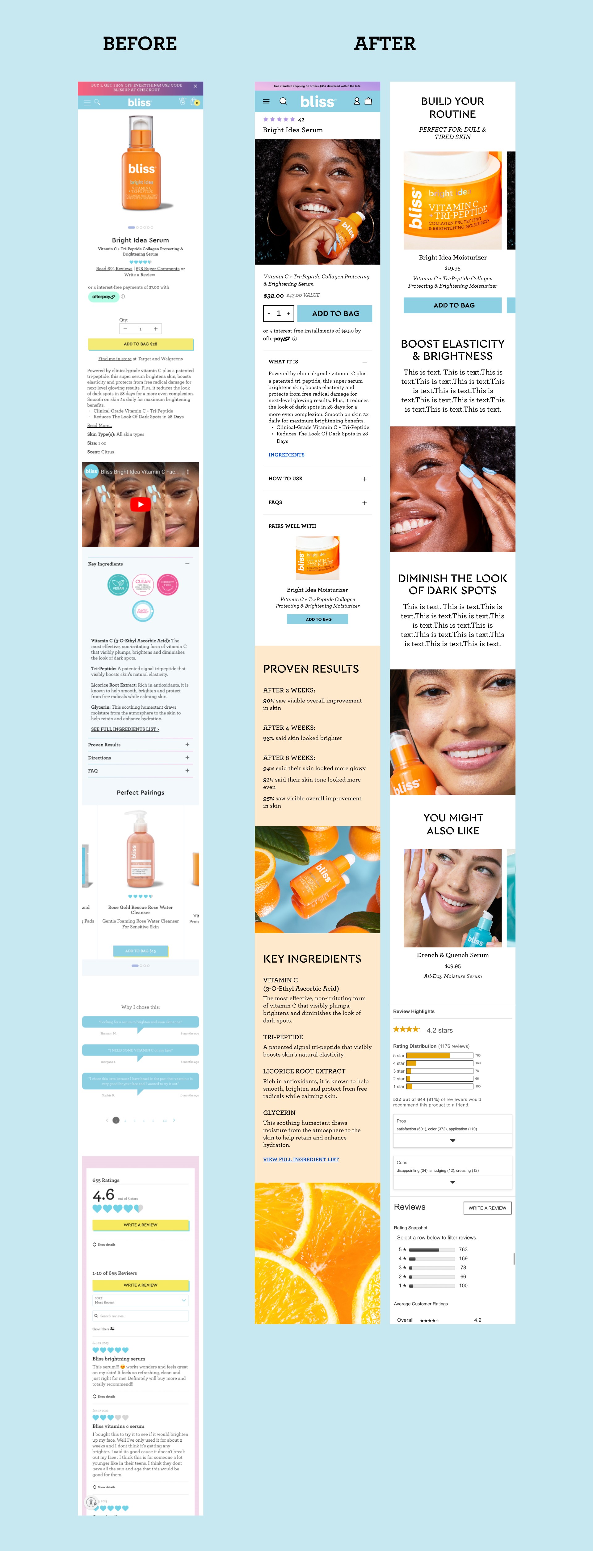
The PDP + Enhanced Content Zones
I introduced a colorful and visual “Enhanced Content” zone - additional imagery and copy below the fold that gives customers more. It allowed the bulk of the PDP to be simplified and created a dedicated area where larger stories (clinical results, videos, key ingredient writeups, etc.) could thrive.
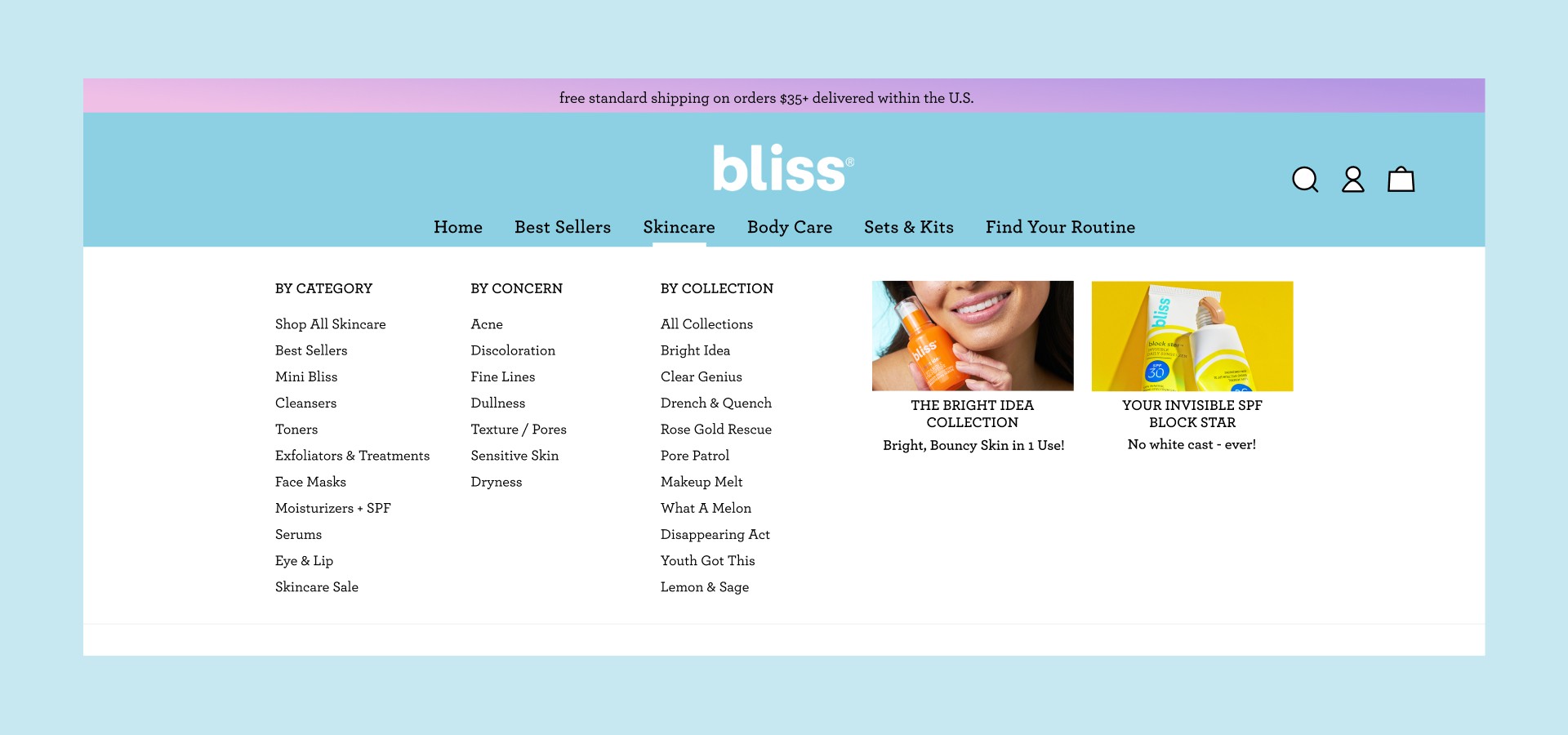
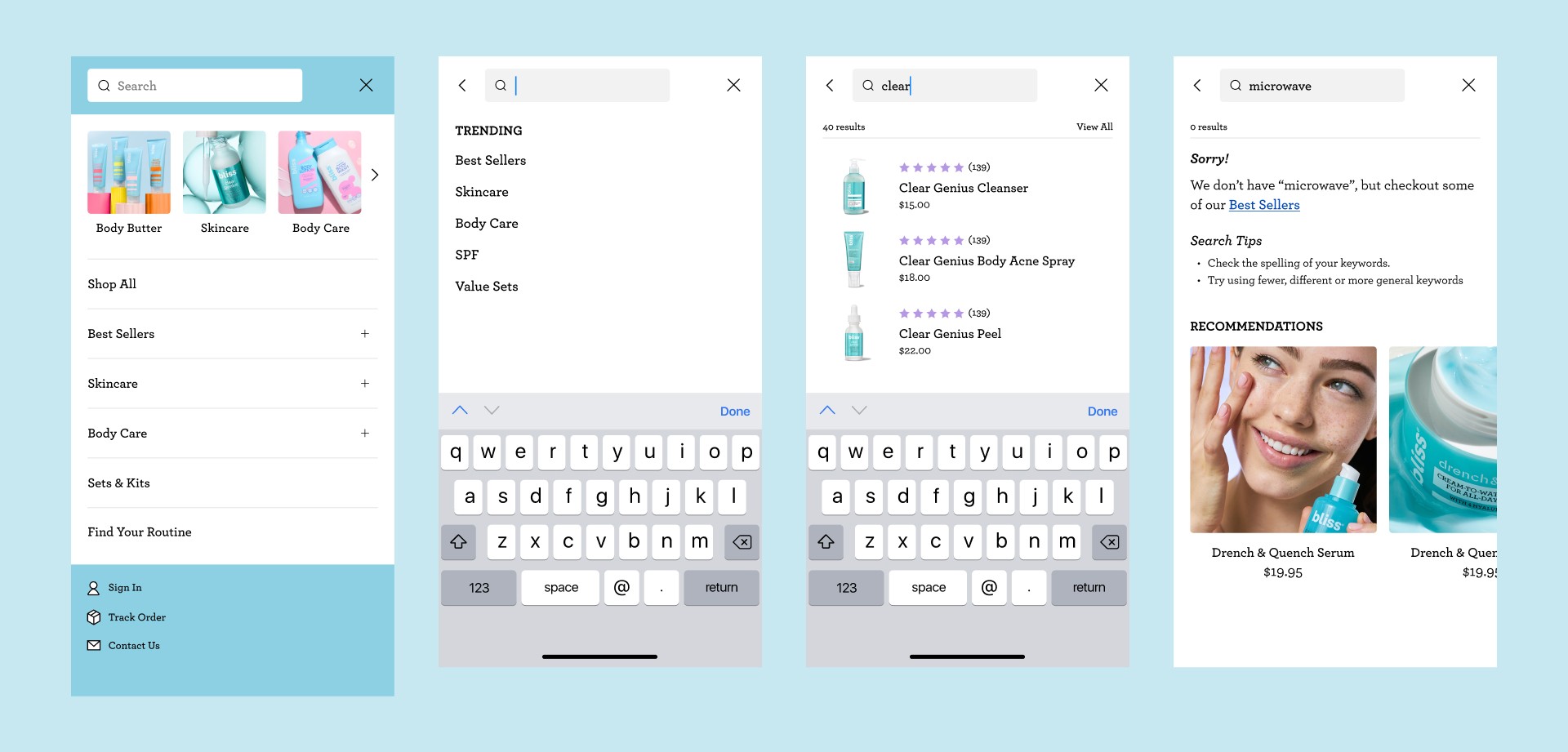
Navigation and Search
Cleaner navigation and a clearer search experience would help filter the large product assortment effectively. For desktop, a mega-menu categorizes by type of product, by concern, or by collection. For mobile, building out a clear search flow and incorporating Quick Links allowed for an easy, visual way to shop quickly.