The Julep brand had undergone a few evolutions but never quite developed a strong brand identity. After getting valuable information on our customer from market research and surveys, I initiated a "re-rebranding" effort, starting with the homepage design.
Where It Started
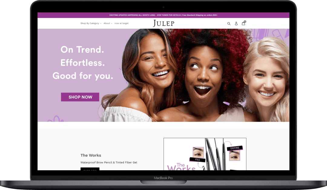
Julep's initial branding leaned youthful and vibrant, featuring saturated colors, playful animations, and bold, rounded fonts. The choice of youthful models was meant to mirror the perceived consumer base.
Where It Stood
In our first rebranding, we adapted to new customer insights. We learned the customer was slightly older, values affordability, and appreciates clean ingredients. The branding shifted to a more muted, softer, and lighter palette. We also introduced a Serif font for a more approachable, but still elegant, feel. Animations were replaced with more authentic photography. While this initial rebrand was successful, it still felt like the brand was lacking an identity.
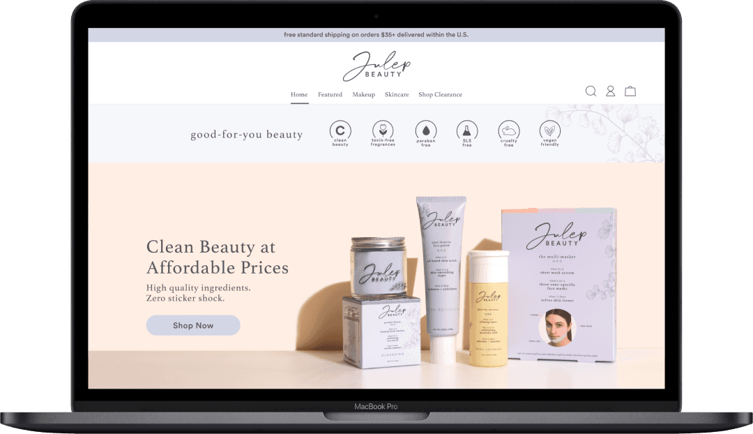
What's Next
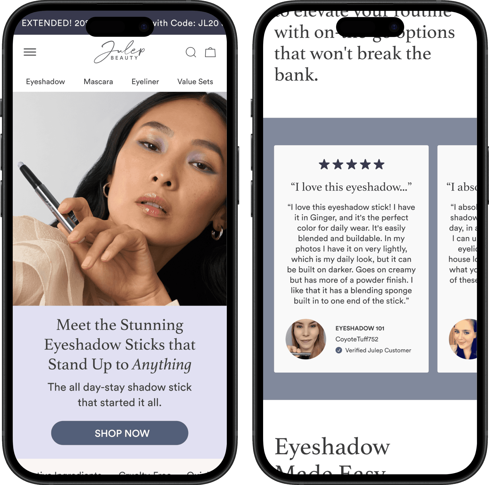
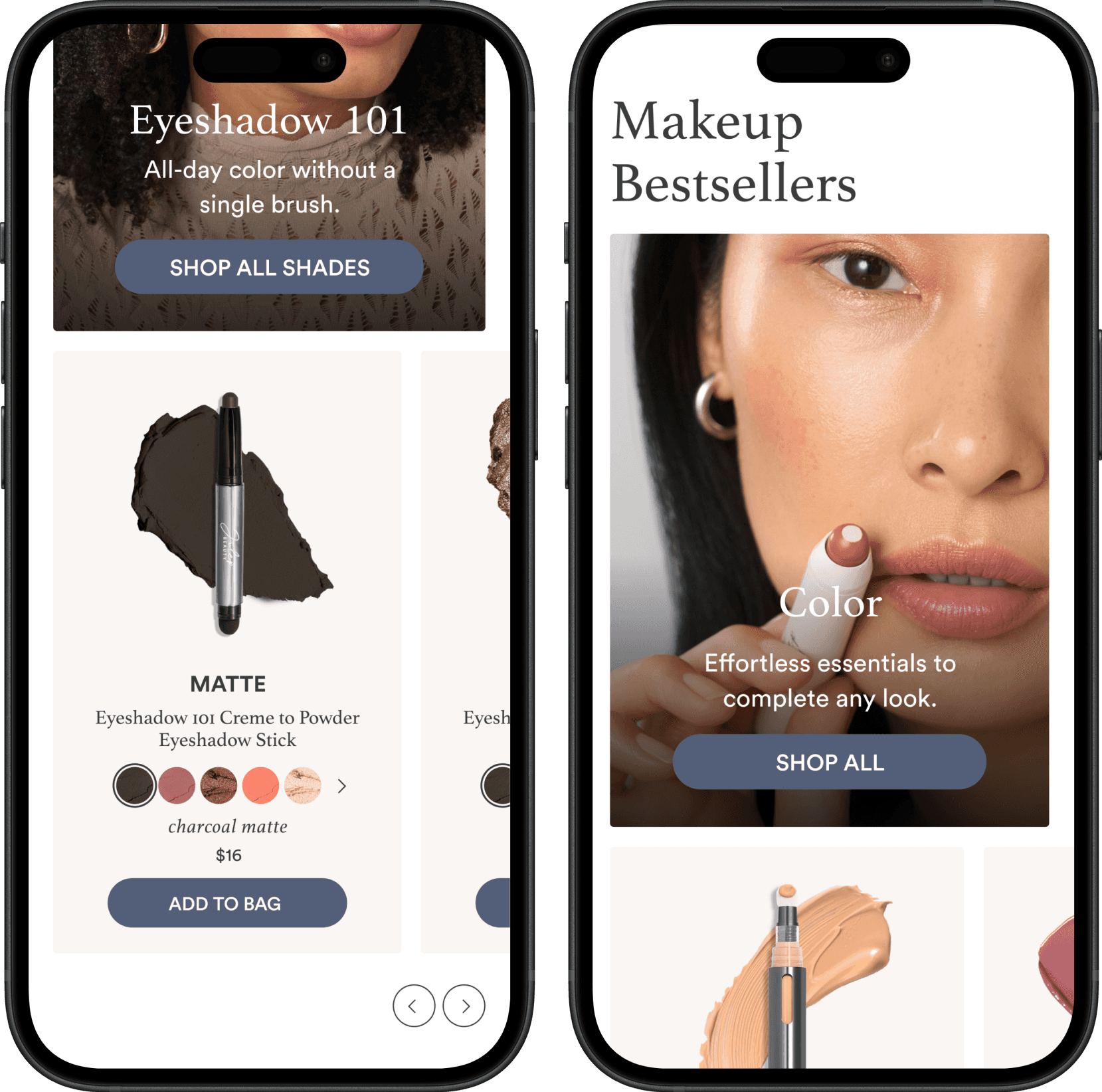
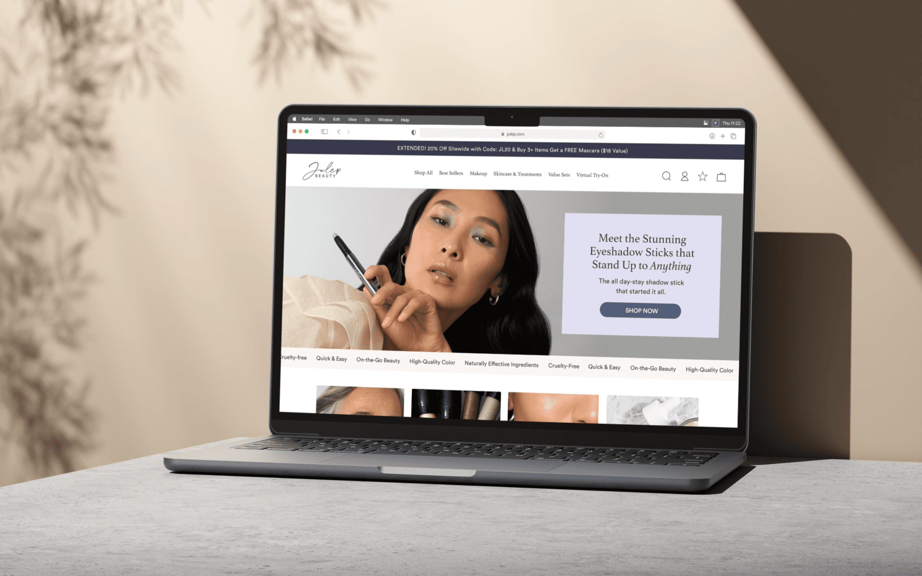
Armed with deeper customer knowledge, our re-rebranding acknowledges an even older audience, who still values affordability, ease of use, and clean ingredients. Retaining softer colors, we introduced more vibrant and darker tones inspired by our popular products like the Eyeshadow 101 shadow sticks. The Serif font was maintained with adjusted spacing to create a more luxurious feel, while we also added a rounded font for enhanced readability on smaller screens.
This new redesign also incorporates social proof sections, shoppable categories, and interactive moments where customers can explore shades and make purchases seamlessly from the homepage. These enhancements enrich the user experience, and give Julep the identity it deserves!

Mobile Designs
A very large percentage of the Julep customer shops on mobile, so it was important to make sure this design was responsive and that all sections would work well and seamlessly on a tiny screen.