
In partnership with ICEE Social, I was the Lead Designer on Starlight Knitting Society's full website redesign over to Shopify!

Clients
Starlight Knitting Society
ICEE Social
Services
UX & Website Redesign
Tools
Figma
Shopify
Website
About
Knit. Shop. Love.
Starlight Knitting Society is a neighborhood mainstay in Portland, Oregon. This beautiful, charming shop was looking to modernize their site's shopping experience - they wanted areas built to assist in product merchandising and an design that allowed customers to explore products easily.
The Challenge
Their site's experience was outdated and didn't give options to easily merchandise products
Starlight's website experience felt outdated compared to competitors and it didn't give the owner the ability to easily market her products or events.
The Goal
Create a site experience that was modern, spoke to the in-store experience and allowed for better marketing
The Starlight team needed a modern e-commerce store that still felt like their brand and like shopping in their store.
The Result
A new website redesign that seamlessly integrated their products in one place, speaks to their unique brand, makes shopping and marketing their inventory easy
Along with a migration over to Shopify POS, their site now supports multiple zones for highlighting events and products, collections that are easy to shop and a site that evokes their branded experience.
Understanding the Brand
From our first meeting, it was very clear how near and dear this brand was to the owner - and rightfully so! I wanted to make sure everything I did evoked the essence of her brand and everything it stood for. Along with my research on the brand itself and its offerings, I completed a full competitive analysis to see what popular brands were doing and executing digitally. This moodboard was the starting point of my understanding of the brand from a visual and emotional standpoint!

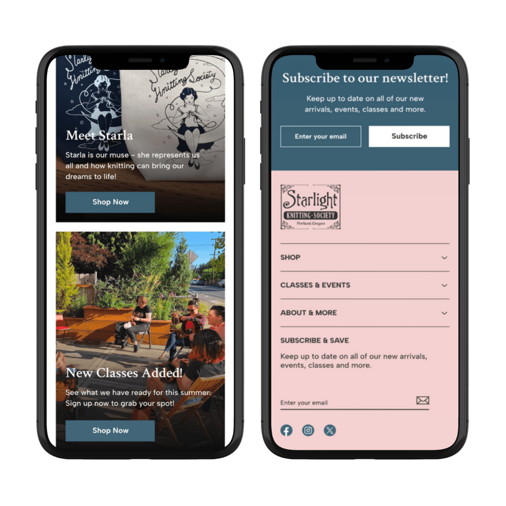
Homepage
Upon taking in the original homepage design, I wanted to make sure that big and bright imagery was immediately a focus. With the in-store experience, you immediately get hit with the vibrancy of the shop - colors galore! I wanted to reflect that here. The biggest change was the introduction of shoppable zones. New arrivals, brand features, product highlights; all of these are available straight from the homepage! This page gets customers immediately acquainted with what the shop offers.


The Product Listing Page (PLP)
Product finding for this customer is especially important. They search for specific products for their specific projects! This required that product finding be extra simple. I designed a clean filtering system that allows customers to find what they need quickly while also being able to still see products (and colors!) clearly.


The Product Detail Page (PDP)
One of the key features of these product types is color - I wanted to make sure to make exploring these colors as easy and modern as possible! I introduced traditional swatches that allows you to zero in on the colors! I also added an in-stock status as well as areas to storytell below the fold.


Coming Together
I also designed multiple screens for all remaining support pages, both Mobile and Desktop! These included About Us, Utility pages, Contact pages, a Search experience, Event pages, Blogs, Quick Views for the PLPs, multiple collection pages and more!
