In partnership with ICEE Social, I had the pleasure of being the Lead Designer on Toys"R"Us's full website redesign over to Shopify!

About
Bringing Nostalgia Back To An Iconic Toy Brand
Toys“R”Us is one of the world’s most beloved brands, where kids have always come first! I still remember the excitement and wonder I felt as a child walking into a TRU store. Now, the brand is making a comeback and you can find it in every Macy’s nationwide! To recapture that nostalgia and magic, the website needed a major redesign and a transfer to e-commerce giant Shopify.
All branding, elements, and content are the property of Toys”R”Us.
The Challenge
An outdated website design was hurting the customer experience
The Toys“R”Us website felt outdated and was difficult to manage in the backend - it was missing the magic and fun that define the brand! It lacked the vibrant colors and the presence of Geoffrey, the iconic and lovable giraffe.
My mission was to revive the nostalgia and enchantment that Toys“R”Us brought to my own childhood!
The Goal
Invigorate brand image and positively impact shopping experience and merchandising ability
Along with improving the shopping experience through a custom design and a migration to Shopify, I wanted to give the team an easier way to merchandise products and build out zones that could mix and match throughout the site. I also wanted to lean into the iconic branding that tapped into the nostalgia of the brand to keep shopping memorable and exciting.
The Result
Modern website redesign on Shopify with a proven increase in customer experience
Along with a transformative move to Shopify and a priority on an optimized user experience for mass-market, the new Toys“R”Us website is now a responsive, colorful and fun experience for both parents and children.
My UX Process
I began with a UX audit to identify areas for improvement and opportunities for brand enhancement. After sending a comprehensive questionnaire to understand TRU’s needs, I conducted multiple brand discussions, competitive analyses, and design explorations.
Throughout the design process, I consistently checked my designs against WCAG 2.0 level AA guidelines for accessibility and against Baymard Institute’s UX guidelines to ensure a research-backed experience.

Homepage
The homepage serves as the “front door” to a brand - customers can get an idea of who the brand is and what they offer. When people go to toysrus.com, I wanted customers to immediately remember what it was like to go into the store - the bright colors, the graphics, the fun - all with a splash of Geoffrey!
Along with a more branded experience, my UX research invited me to focus on bringing opportunities for TRU to merchandise their products more effectively with themed zones, a Shop By Age Banner and category carousels! The overall result was a much more shoppable page with limitless opportunities to give parents what they are looking for.

Always Mobile First
A big focus of this redesign was ensuring a consistent and seamless mobile experience. A common theme among many e-commerce stores, a very large portion of TRU shoppers are mobile shoppers. The mobile experience was prioritized in every design!


A Reimagined Navigation
TRU’s original navigation of simple dropdowns created many issues for their team - it was limiting, it was tough to physically navigate and was hard for customers to truly find what they were looking for.
For Desktop, I redesigned this navigation to be a full experience with a drawer design that slides in from the left. All top-level categories are accessible and easily scannable to make shopping quick and efficient. The mobile experience was also streamlined to ensure customers can navigate to collection pages easily.
The Product Listing Page (PLP)
Taking lessons from the original PLP design, my goal was to clean up the filtering system as well as improve the overall product browsing experience for parents. We made the filters dynamic, category-specific and changing based on user input for a customized experience. I also made the product imagery larger, giving customers a bit more visual information to make informed choices.
For the brand collection pages, I built a few adjustable zones and carousels to allow for flexible merchandising needs.

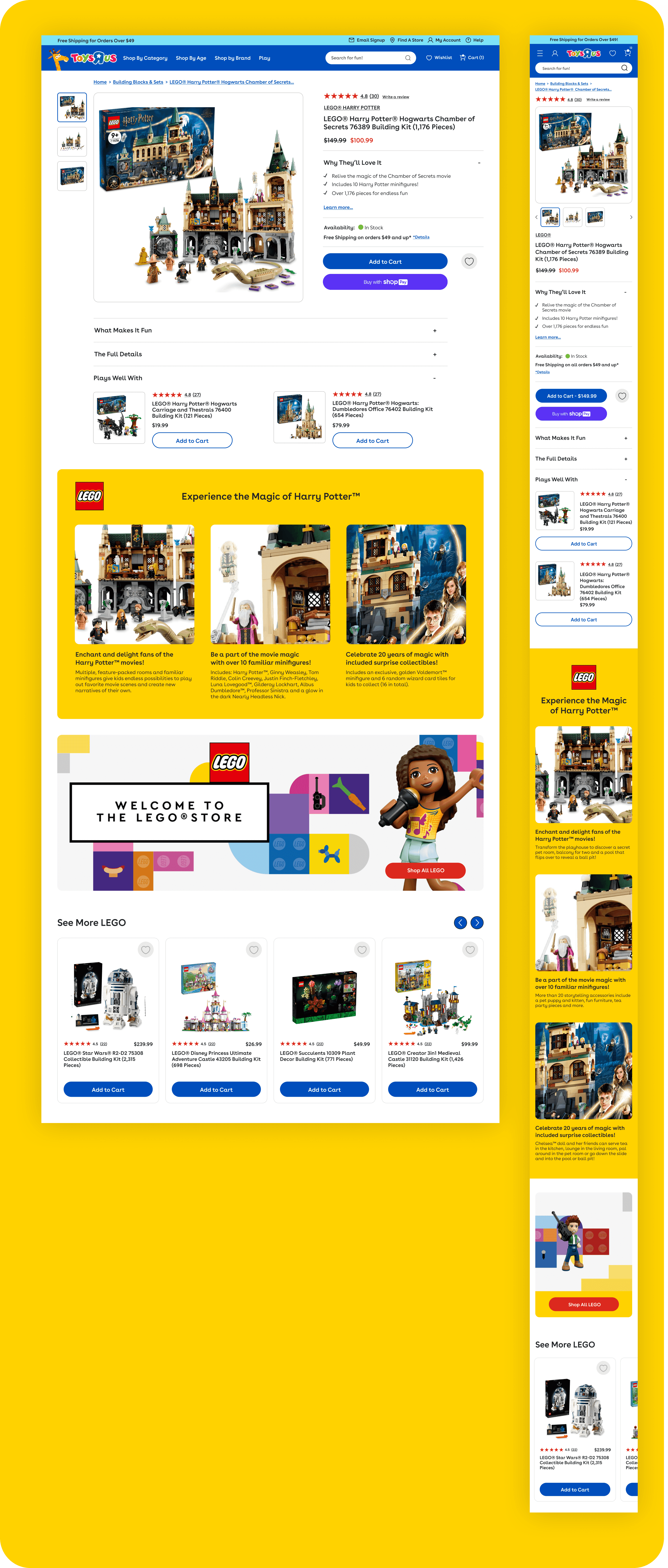
Product Detail Pages
The PDP is one of the most important pages on the site - this is where customers make their final decision to purchase a product! For TRU, my priorities were to optimize the flow of information. In the original design, product imagery was small and information felt disjointed. I enlarged the main product imagery to allow customers to see what comes with each toy as well as showcase additional imagery. Information, price, reviews and more can be found all above the fold to introduce the product, where A+ Content, other recommended products, and further information can be found upon scrolling down.

PDP A+ Content Zones
The previous design of the product pages were very simple and didn’t give TRU the opportunity to have any storytelling about their products. I designed A+ content zones below the fold that could be mixed and matched to their desire that would allow for this story building! This also allows the opportunity to showcase additional product imagery and brand information.
Supplementary & Courtesy Pages
I also created various supplementary and courtesy screens and pages to ensure a smooth experience. These included pages for Activities, a Blog, a Location Finder, About Us, Email Sign Ups, a Geoffrey Landing Page, a Chat Experience, Search, a Help Center, a Cart Experience and more.
