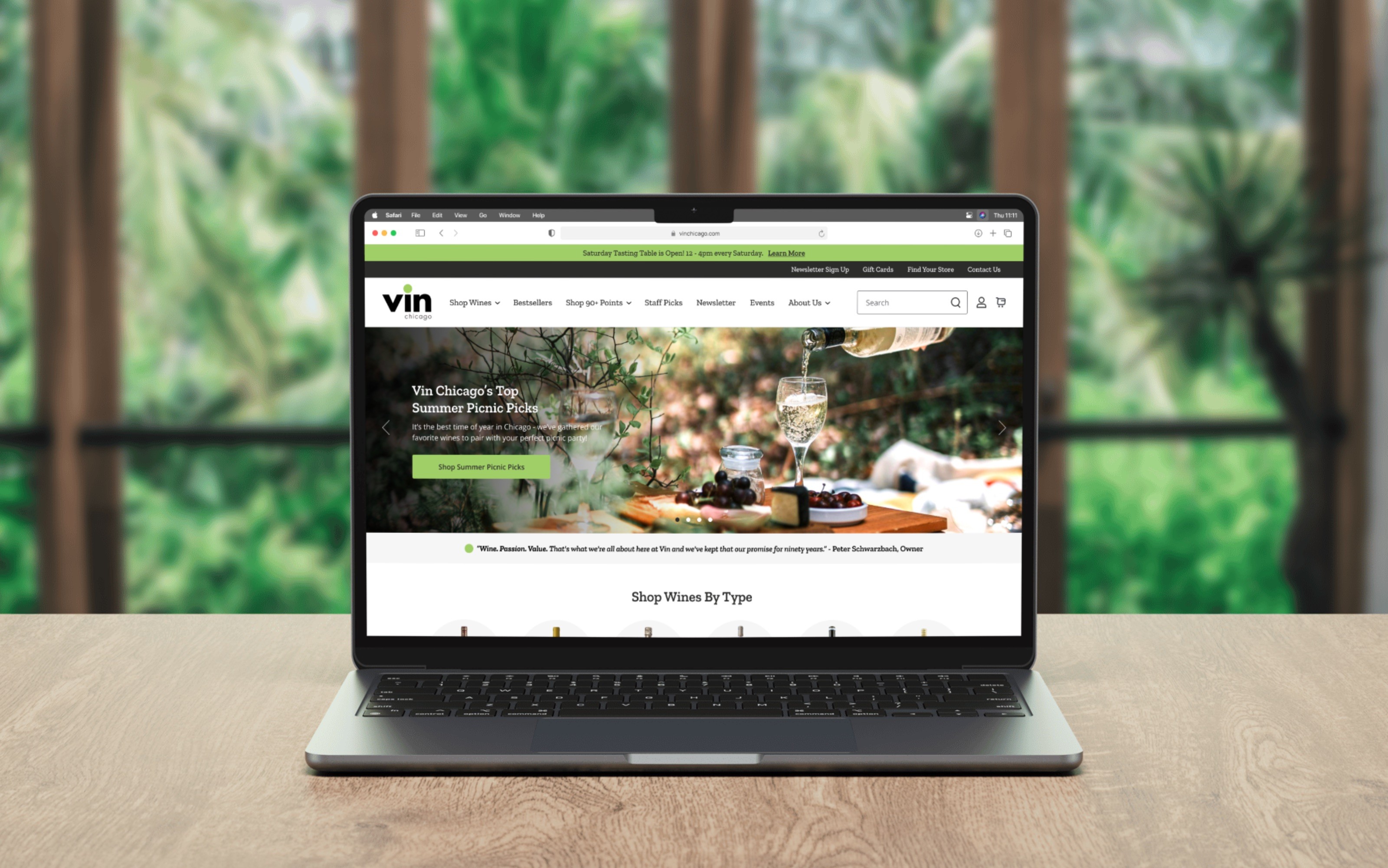
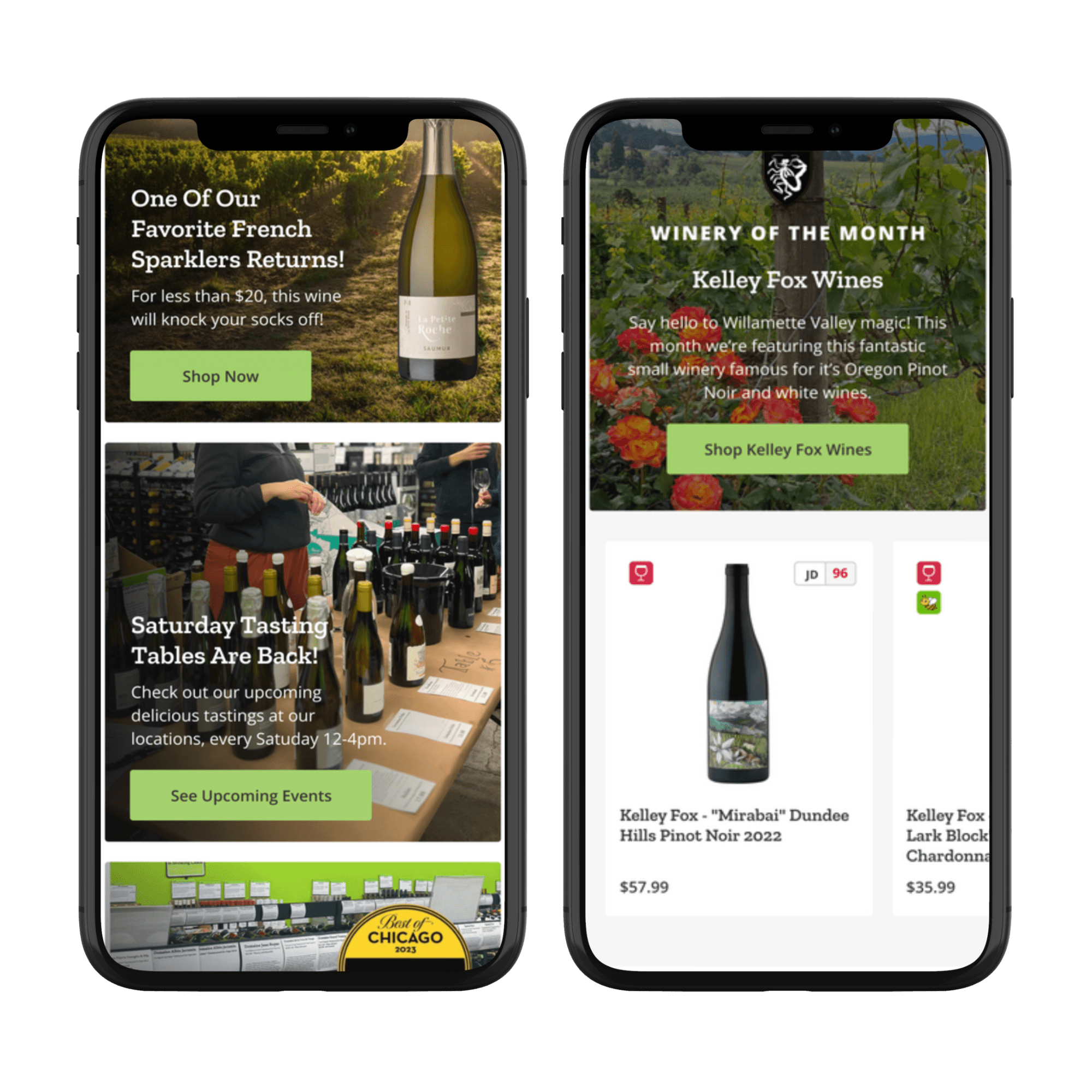
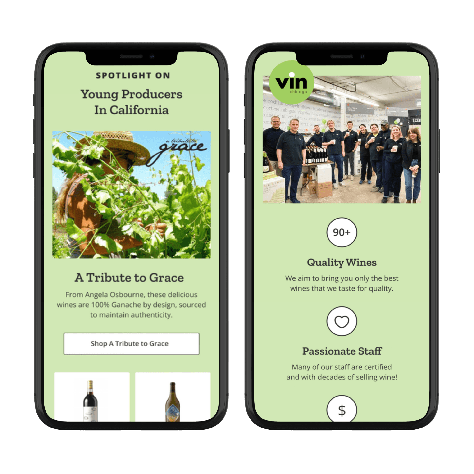
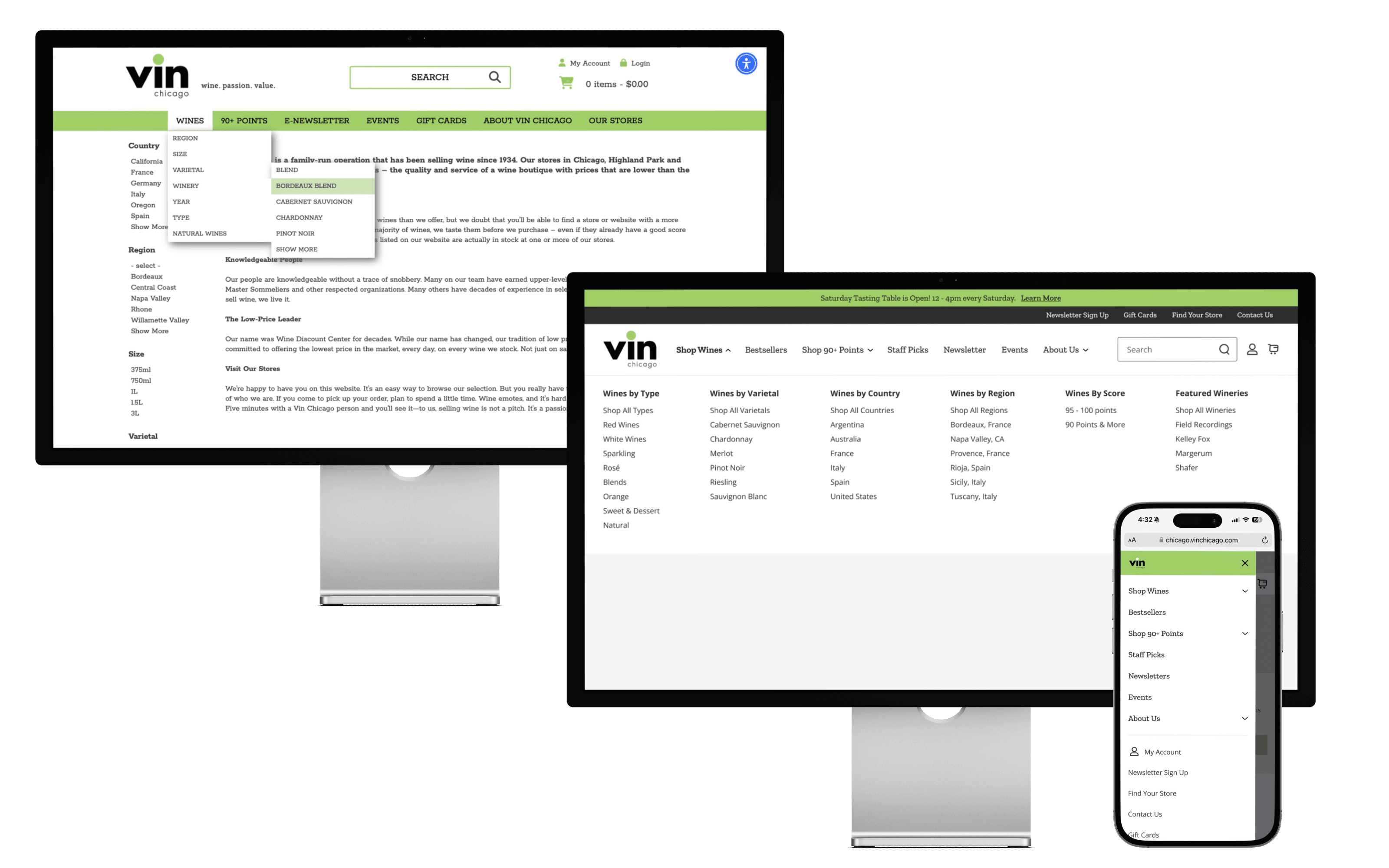
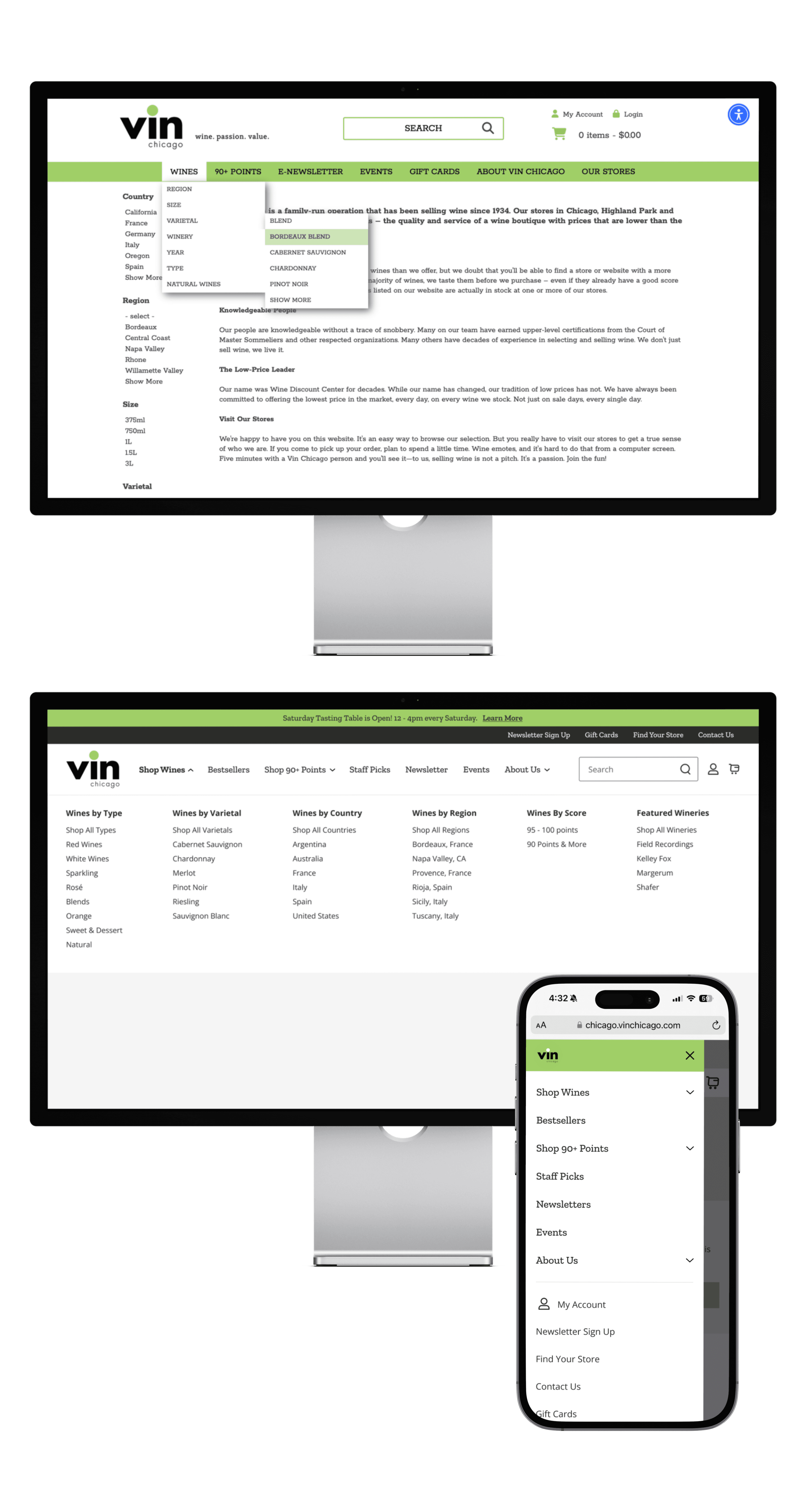
In partnership with ICEE Social, I had the pleasure of being the Lead Designer on Vin Chicago's full website redesign over to Shopify!
About
For the Love of Wine
Vin Chicago is your quintessential, family-owned and operated wine store where stories are the main driver of their business. Their tagline speaks to what their business is all about - Wine. Passion. Value. My job was to revitalize their online presence, take their branding, stories and warm, human in-store experience and make it come to life on the digital page.
The Challenge
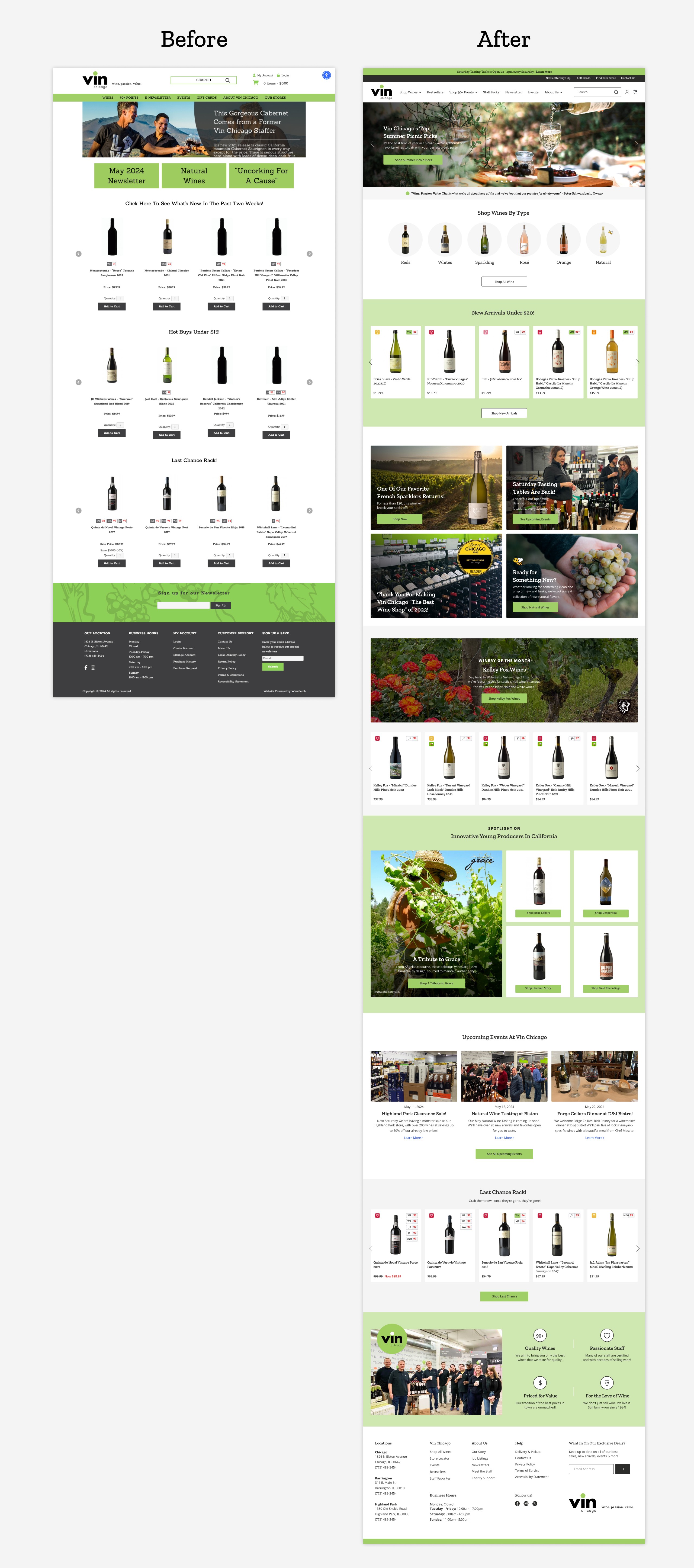
The site was a disconnect from their in-store experience, hard to shop and hard to merchandise
The Vin Chicago website experience for both customer and digital manager was confusing and difficult to navigate. Their in-store experience is next level customer service and it didn't translate to their online presence.
The Goal
Bring the human element back to their site, where the love of wine and finding good wine takes center stage
The Vin Chicago team needed a centralized place to easily merchandise their large inventory and highlight their branded stories throughout the site. Along with a transformative move to Shopify, the goal was to bring the team the opportunity to do what they do best - to find you the best wine at a great price!
The Result
A fresh website redesign on Shopify that gives the team multiple ways to market and storytell.
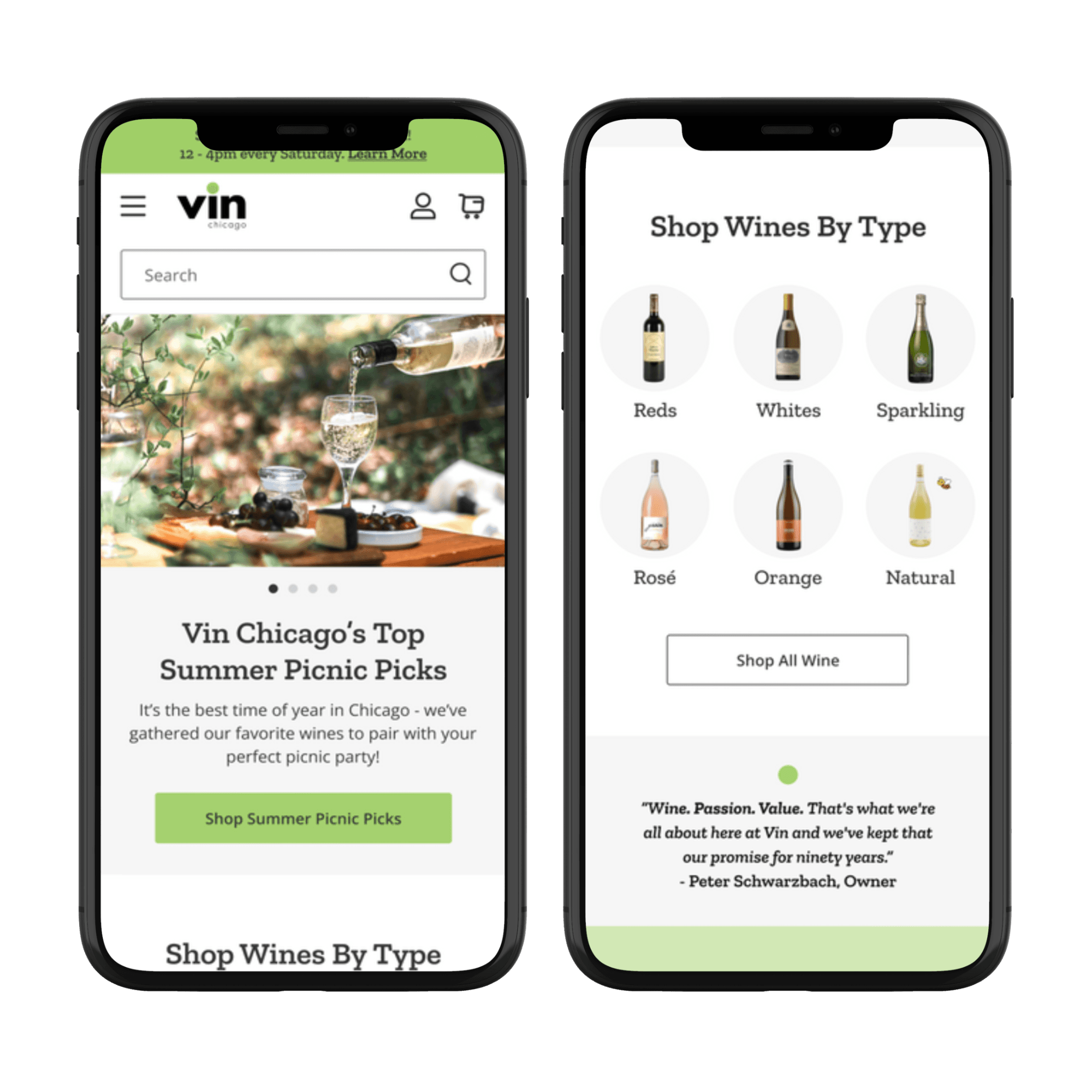
Moving to Shopify gave Vin team a centralized solution to better manage their large product selection! A dynamic redesign brought their iconic in-store experience to online, giving customers an easy and modern way to shop their inventory, see new events, and interact!
Understanding the Brand
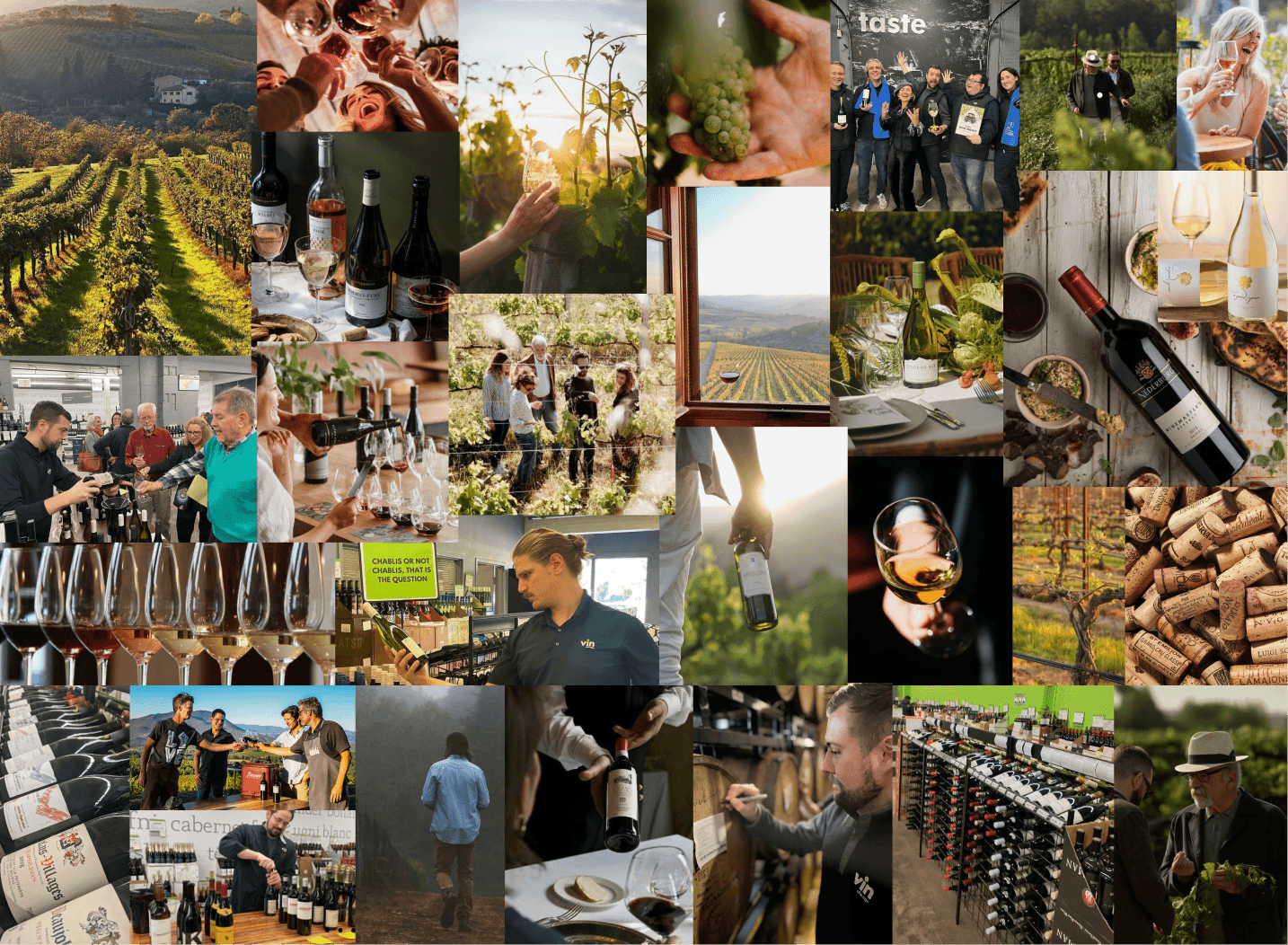
Vin Chicago has been selling wine since 1934. It's a true family business, with customers who are very passionate about shopping there. Along with compiling answers from my detailed brand questionnaire, I wanted to really get a feeling for what the "mood" of the site was going to be. This was our final mood-board to guide the branding of the site!
Homepage
Their homepage was one of the biggest opportunities to infuse the brand and storytelling, while giving customers a quick and easy navigation to find what they need - and fast! Large, vibrant in-store and dreamy wine-themed imagery took center stage here, alongside quick navigation to various wine collections. One of my favorite additions was a big highlight of small wineries and farmers - a cornerstone of their business!
The Product Listing Page (PLP)
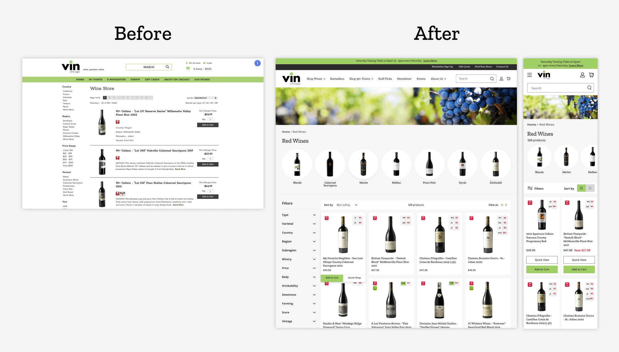
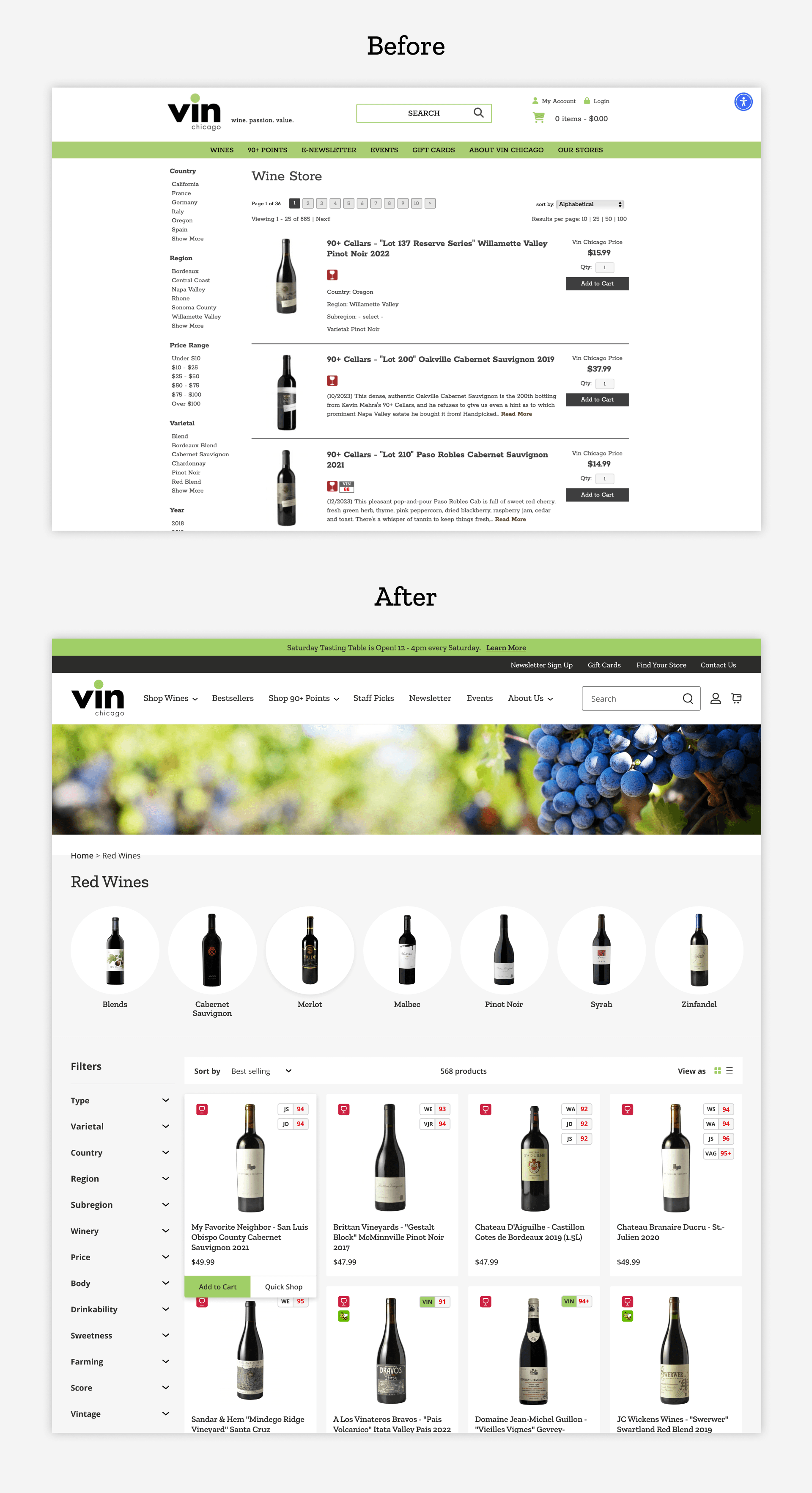
After auditing the original PLP designs along with it's filters, I aimed to revamp the entire experience to make it more visual and easier to silo down. For this example of the "Red Wine" collection, I introduced a new section above the main product list that allows customers to shop top red wine varietals right away. Many of their customers know what they like or what type they are looking for! Filters were optimized from customer learnings to make it easier to customize the search. Customers also value wine scores from famous reviewers, so these were kept on the product tiles too!
The Product Detail Page (PDP)
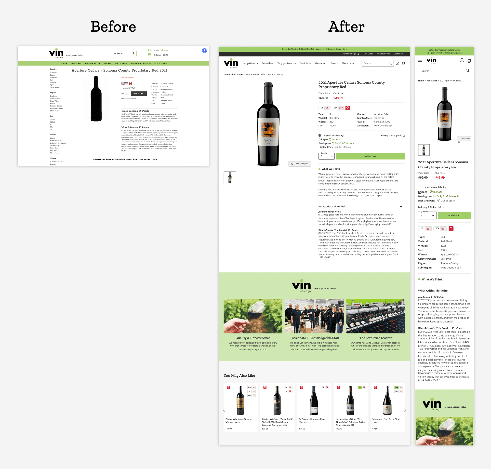
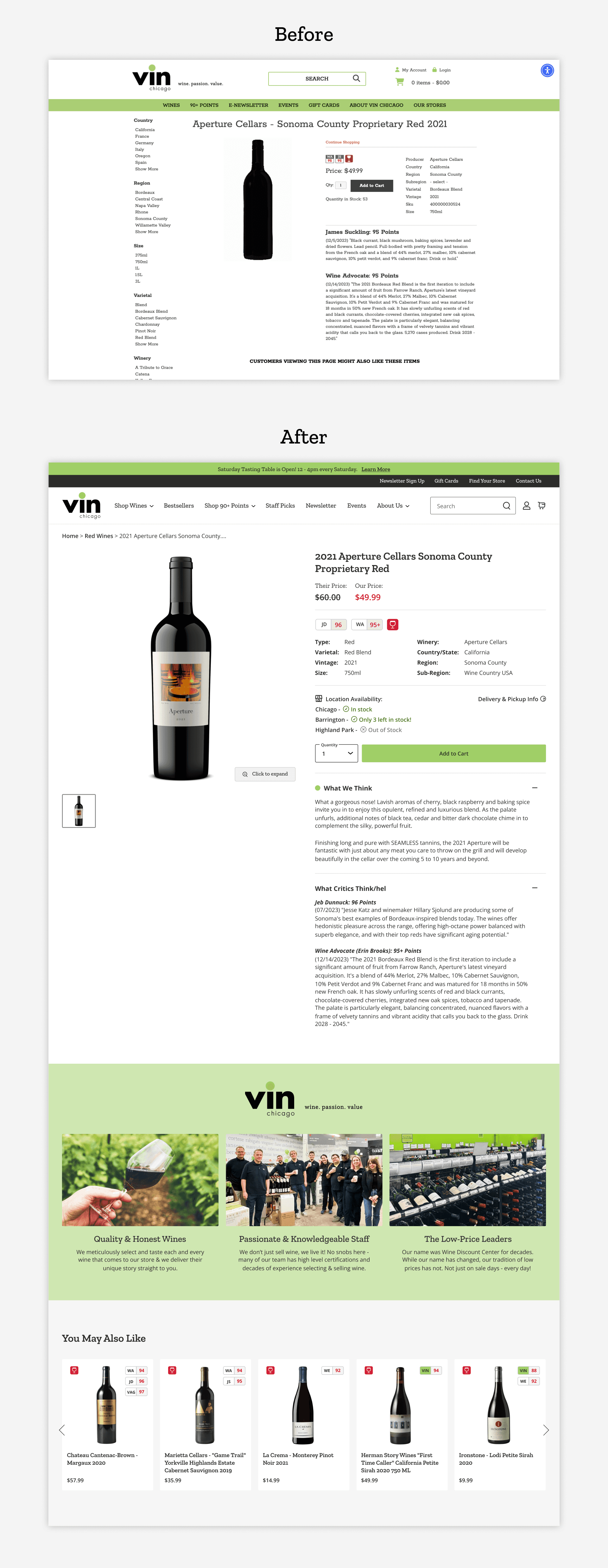
The original PDP design did not allow for any storytelling for products outside of the "points" zones. It also kept all the filters from PLP to the left of the product, which is a confusing experience and can distract customers. With my redesign, I introduced a large image zone, multiple image/text zones for storytelling below the fold, as well as a location availability app to clue customers into how much stock is left! I also brought a price comparison zone to show the outstanding value Vin Chicago offers. Lastly, I included a dynamic "You May Also Like" zone that would pull recommended wine choices based off search behavior.
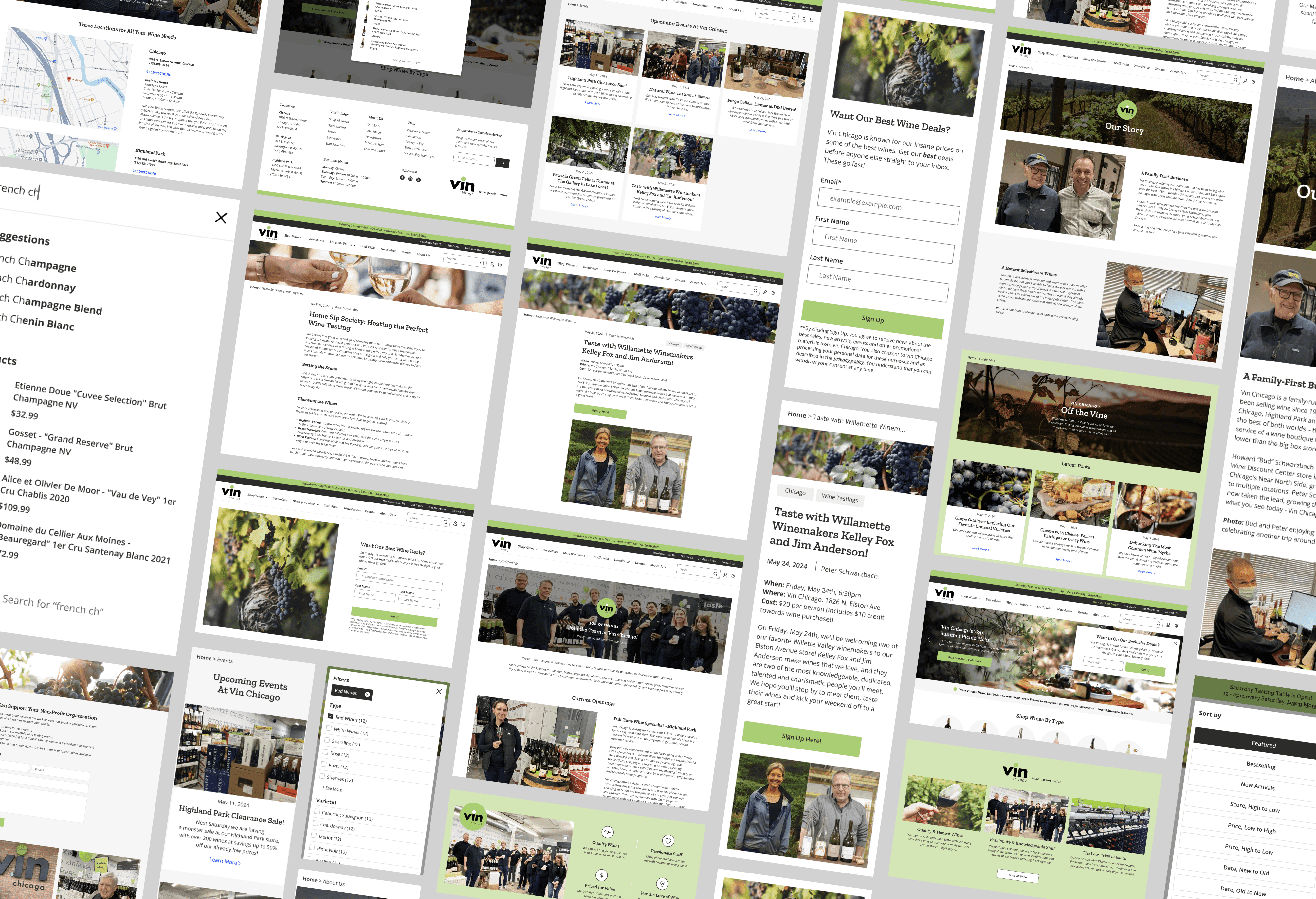
A Complete Picture
Along with the main pages, I also designed multiple pages to support the rest of their site experience. This included a redesigned search experience, a Newsletter sign up form, About Us page, Blog and Article pages, Utility pages, site banners, Contact Us, Job Openings, Account pages, Events and more!
