Cover FX is a well-known complexion brand in the beauty industry. This redesigned website was a key part of the larger rebrand when the brand was acquired by AS Beauty. I led the digital brand and site redesign for this new story, along with my team of Creative Art Directors, Digital Designers, Retouchers, and Copywriters!
About
Back to Basics
The Challenge
The site and brand experience was misguided, leading to more questions than answers when shopping
Cover FX has a huge following and was an Ulta-favorite brand for many years. It was known for it's high-quality complexion products, but it's brand identity did not speak to high-performance or high-quality. It's site experience did not support easy shopping or product finding.
The Goal
Create a memorable digital identity and shopping experience for all skin.
Improving the shopping experience for complexion products was priority number one. The goal was to create a bold but approachable digital identity for the brand while making it easy to find your perfect shade for it's high-quality foundations.
The Result
A realigned mission and customer experience that showcases and makes real skin the story
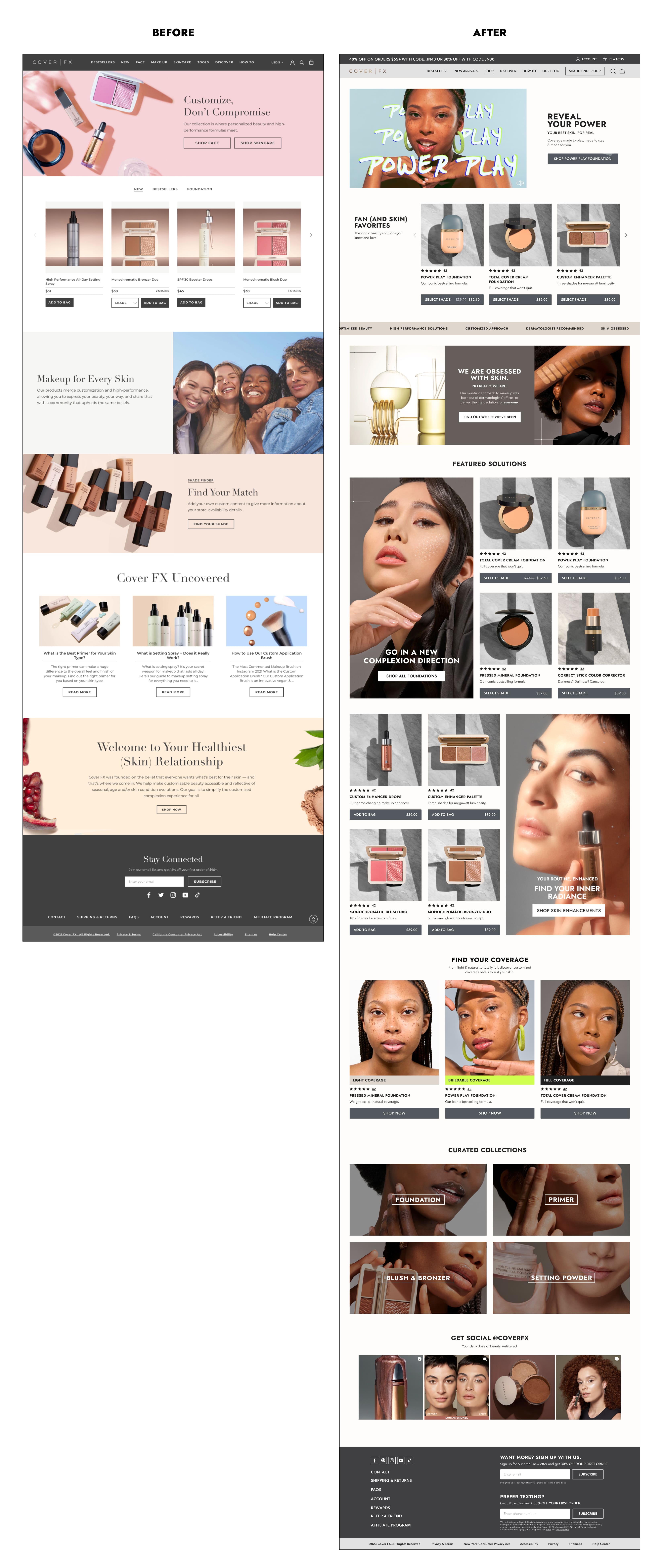
The site was completely reimagined with brand new site hierarchy, layouts, imagery, digital elements, product pages, and more - complete with a diverse set of models and a focus on showing real skin!
The Homepage
We first took learnings and data from consumer marketing research, as well as other brands under the AS Beauty umbrella, when beginning the site redesign. We knew this customer was drawn to the high-performance and solution-based elements of the brand, which we translated into the design. Our focus was to showcase larger imagery to highlight real and diverse skin types in model imagery, editorial videos, and clean and clear product photography.
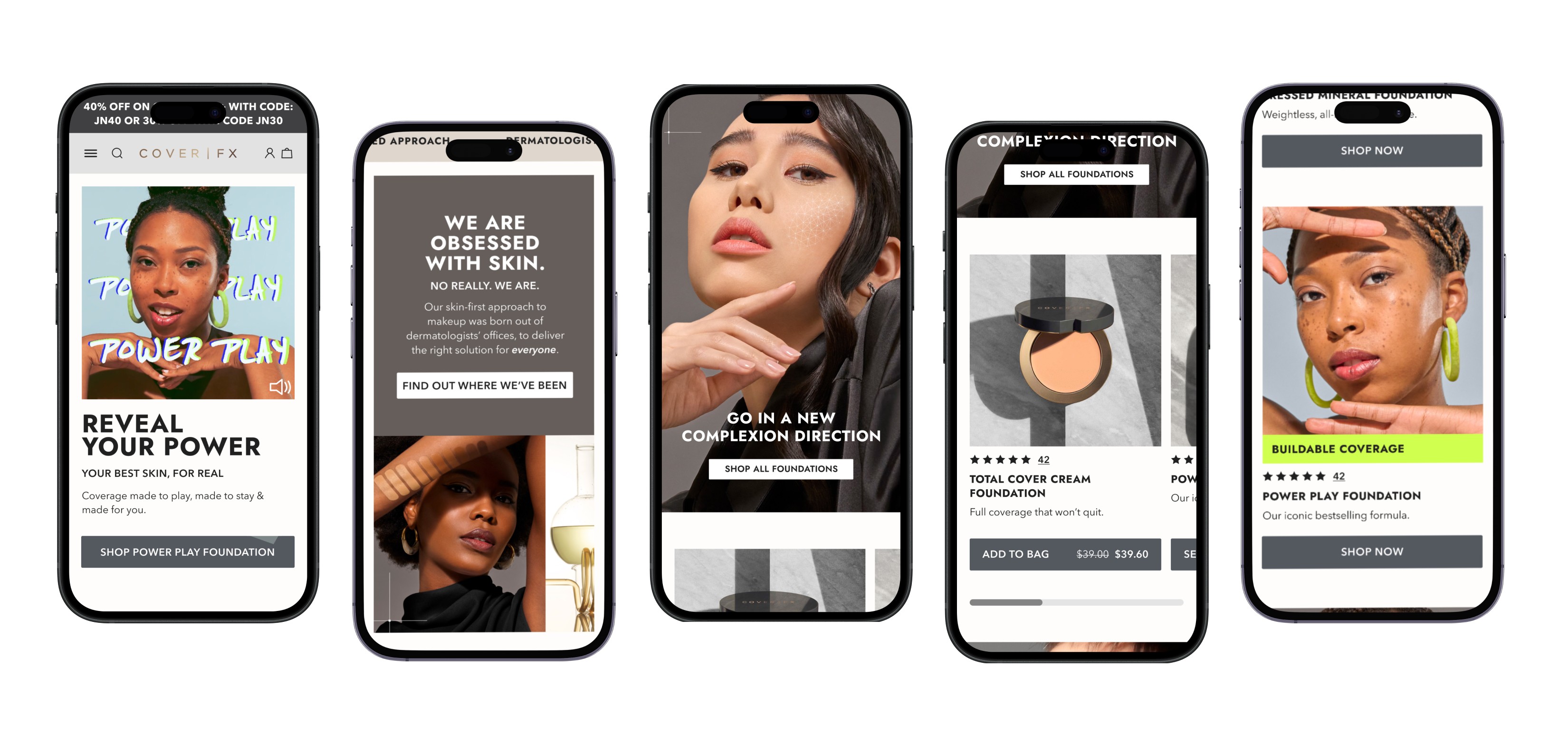
Designing for Mobile
As always, priority was always given to mobile designs to ensure a clean, clear experience on smaller screens. Using CTA’s that pop off the page, large imagery, as well as swipeable modules to showcase our products kept this page concise and focused on a straightfoward shopping experience.
The PDP + Enhanced Content Zones
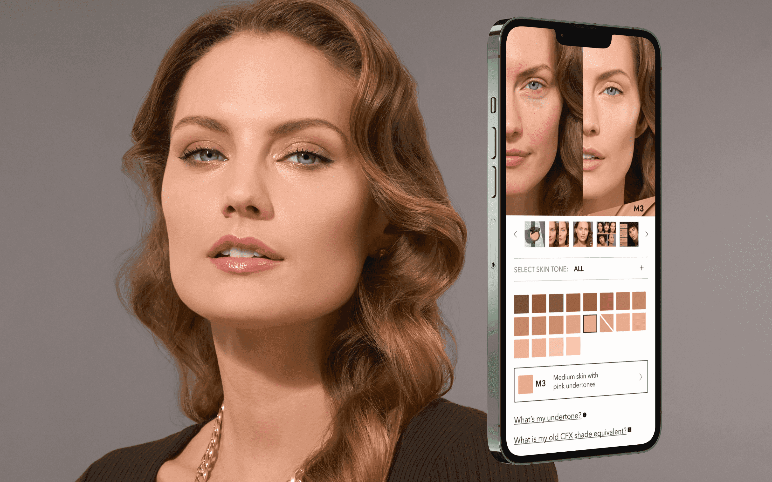
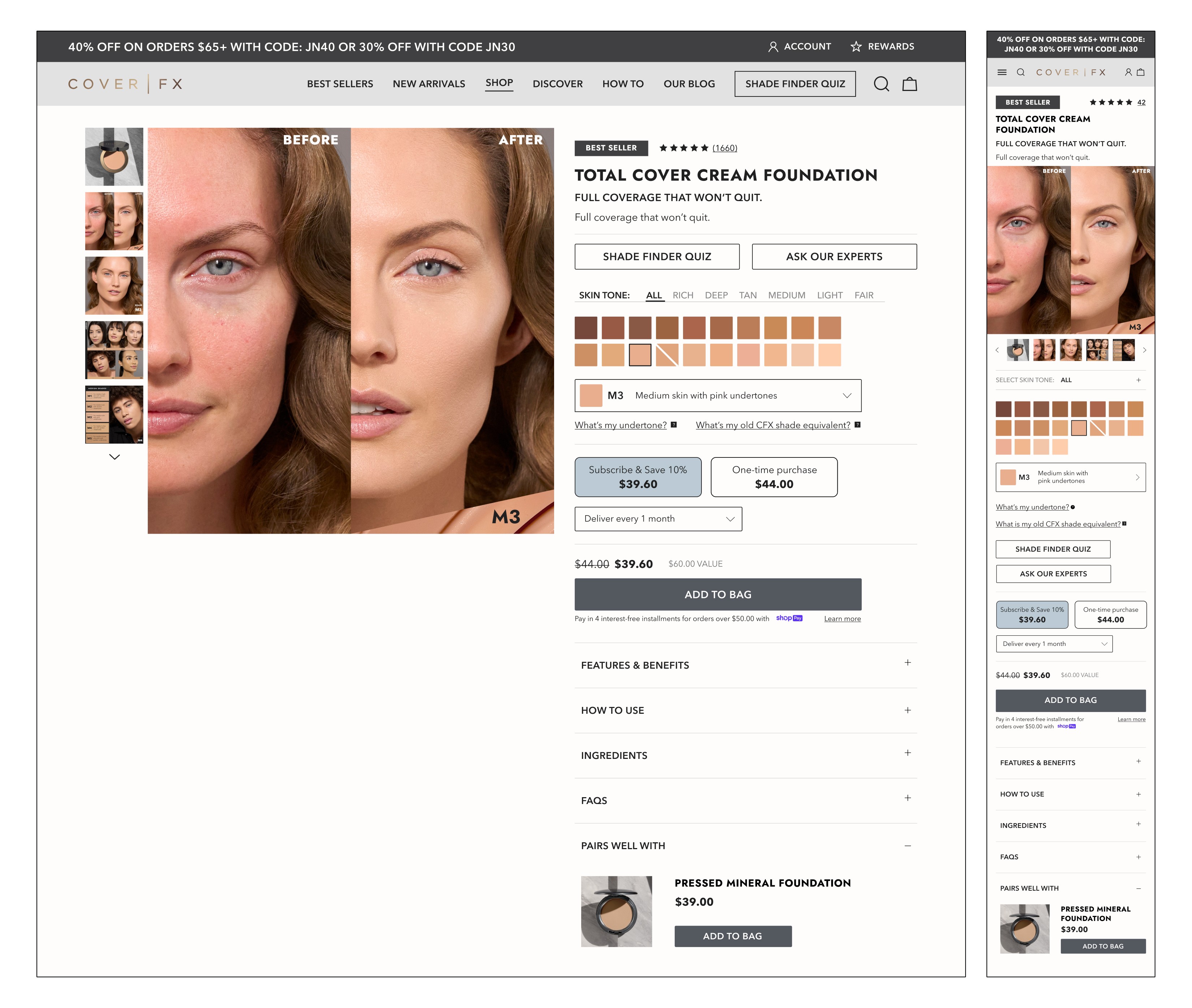
Cover FX transitioned from a retail model to a strictly D2C brand, which amplified one of the biggest challenges in building a Product Detail Page (PDP) for a beauty brand: How to find your perfect foundation shade on a computer screen. I wanted to ensure this customer found the process seamless and simple.
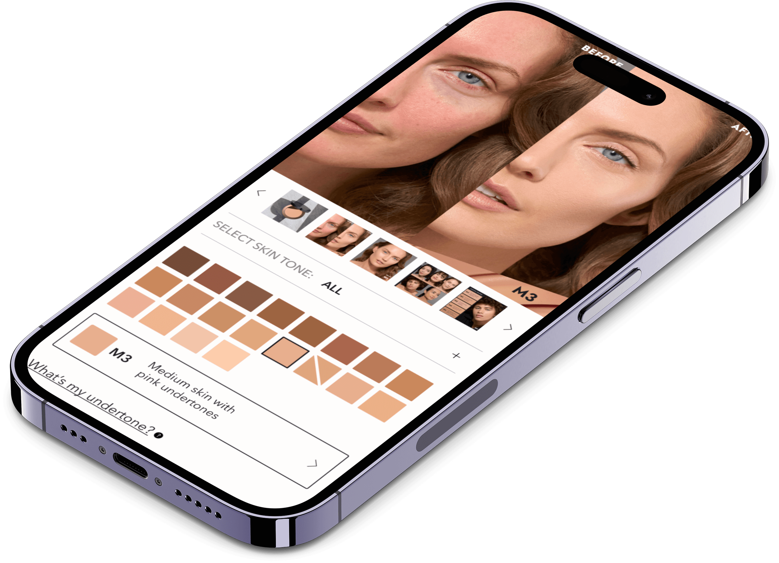
By incorporating large variant squares, a clear filtering system, quick links to a shade finding quiz and chat service, as well as education pop-ups on undertones and previous shade equivalents, we provided numerous resources to help.
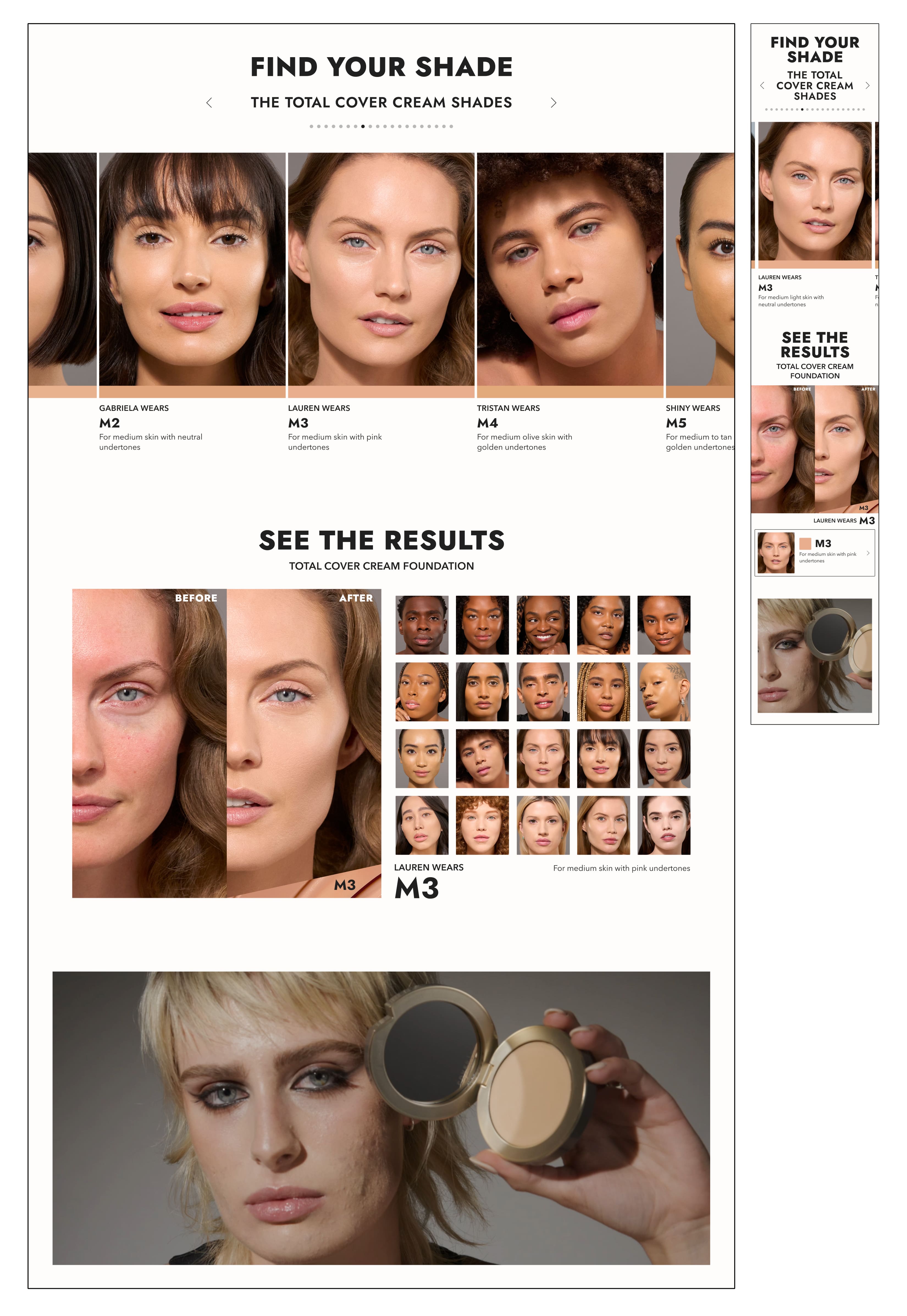
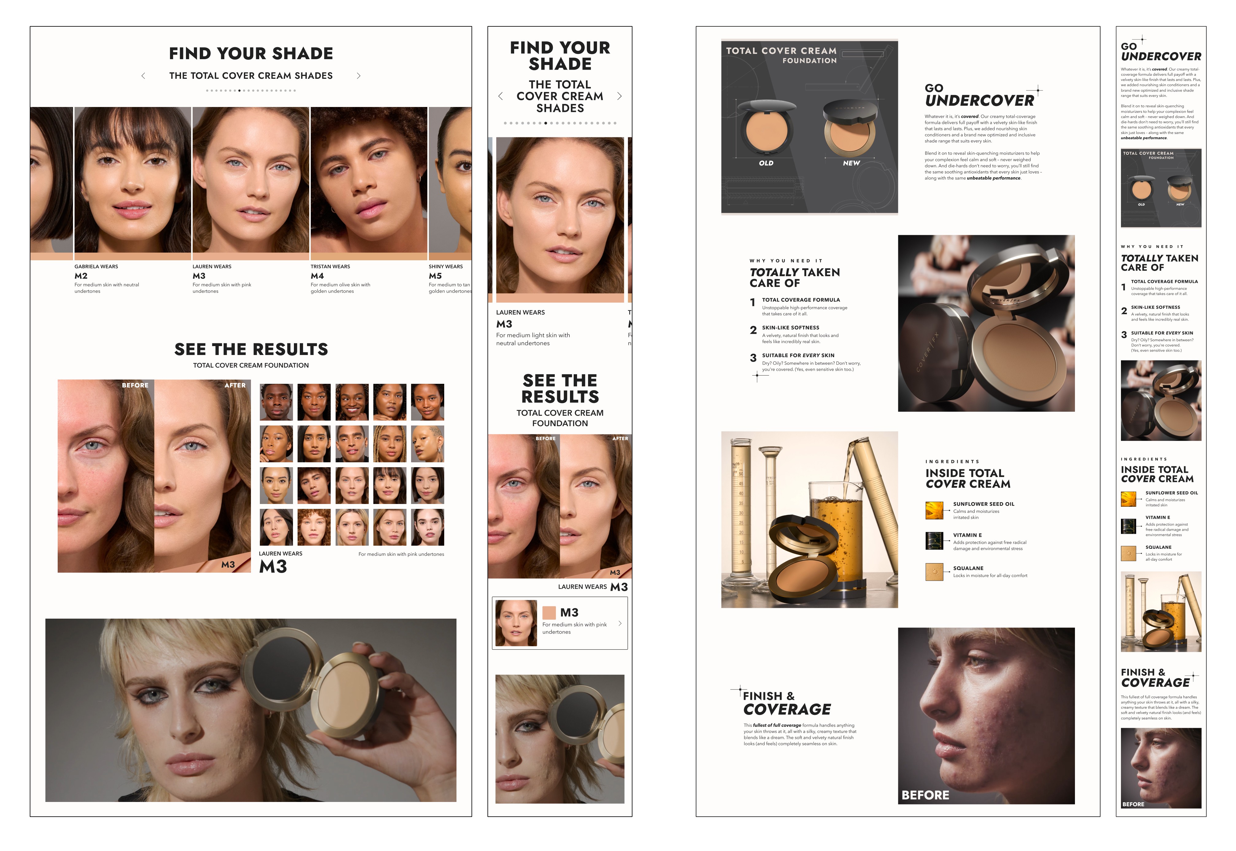
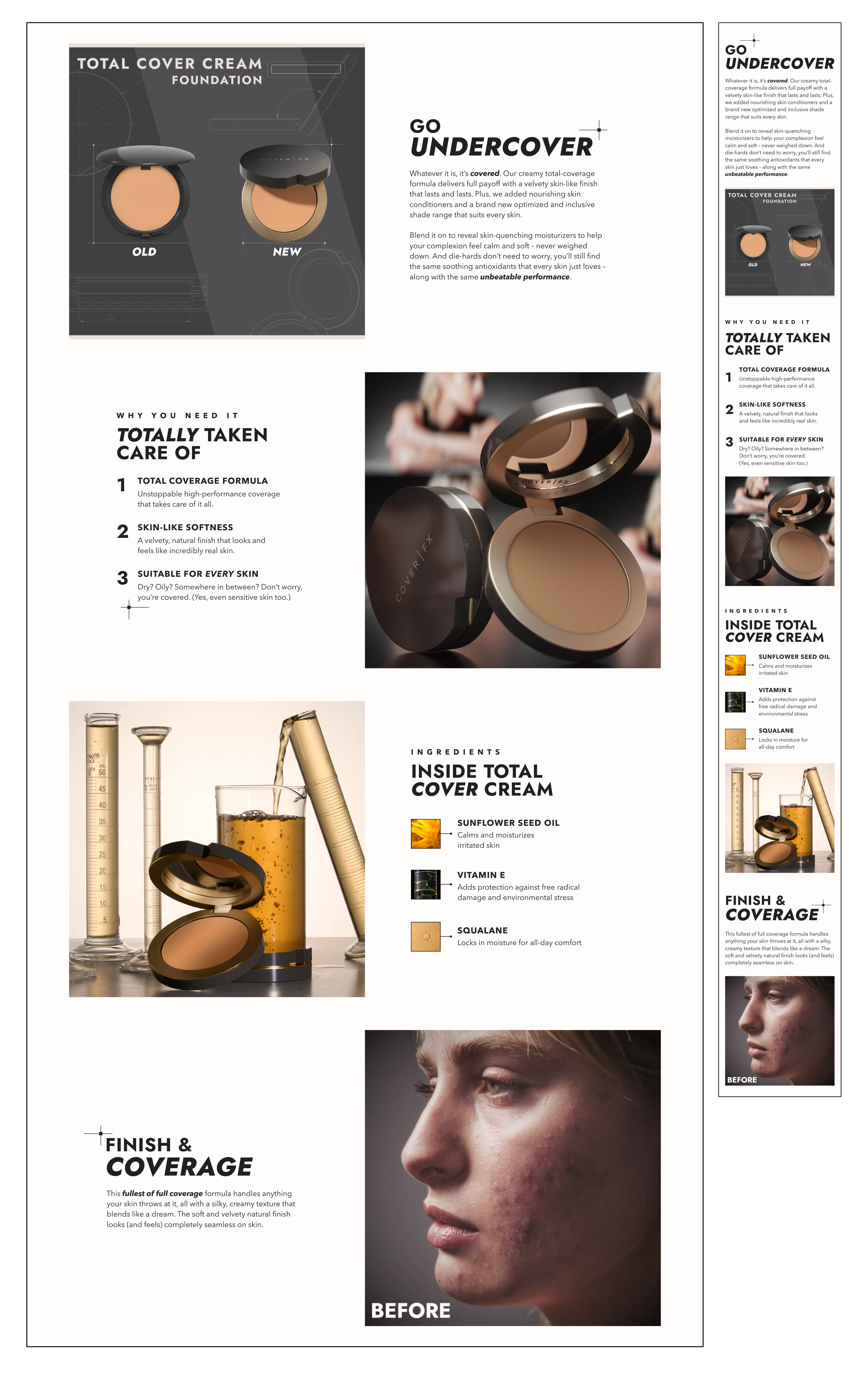
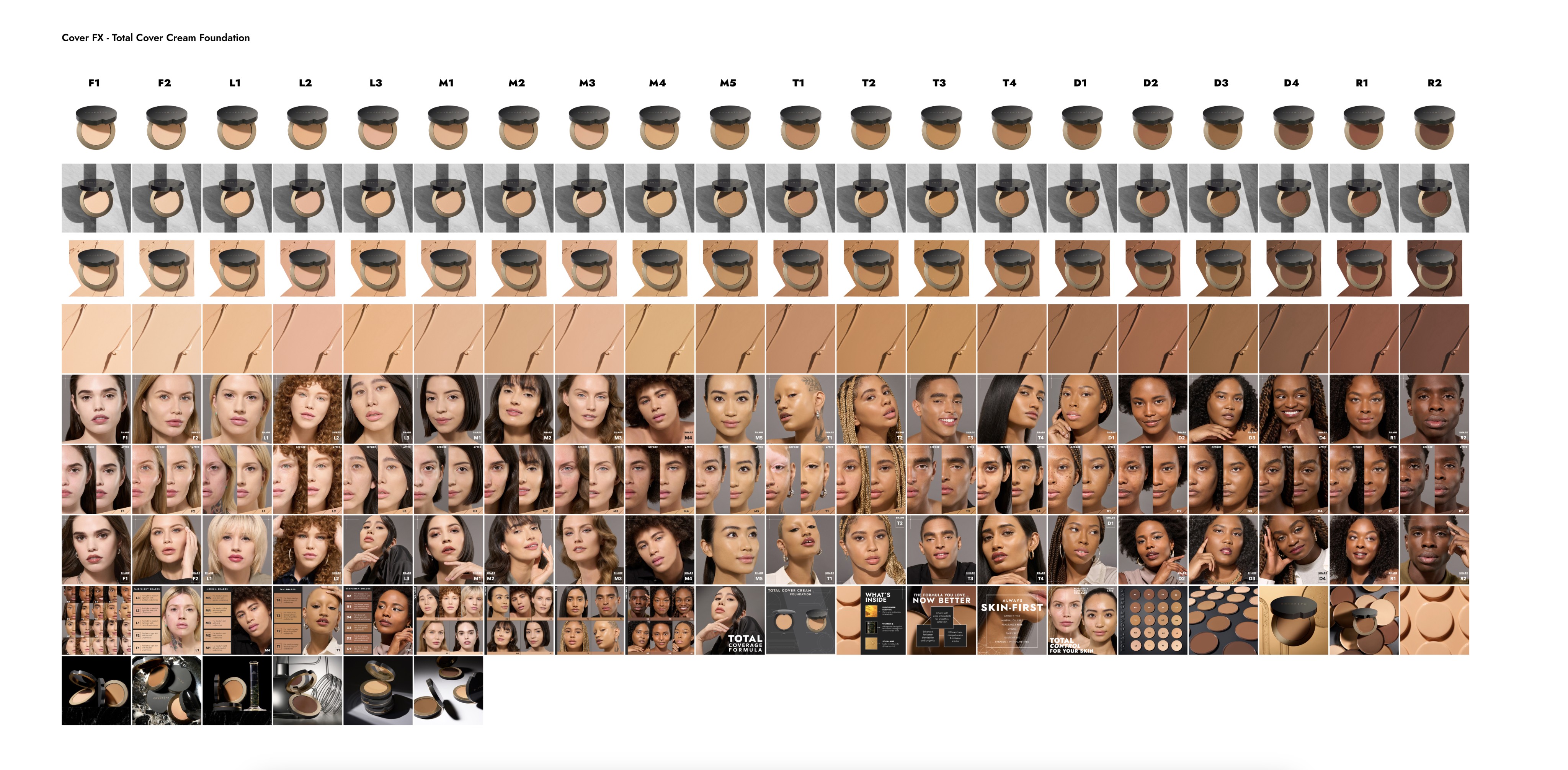
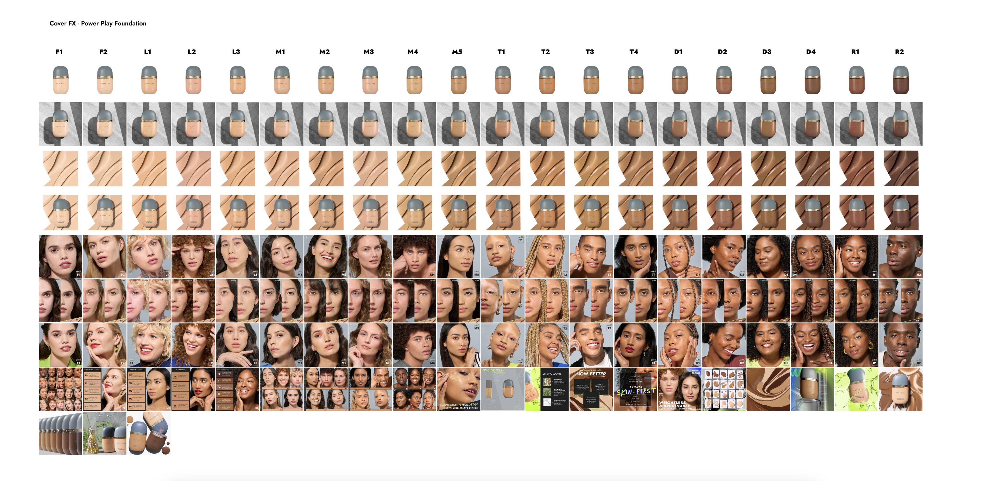
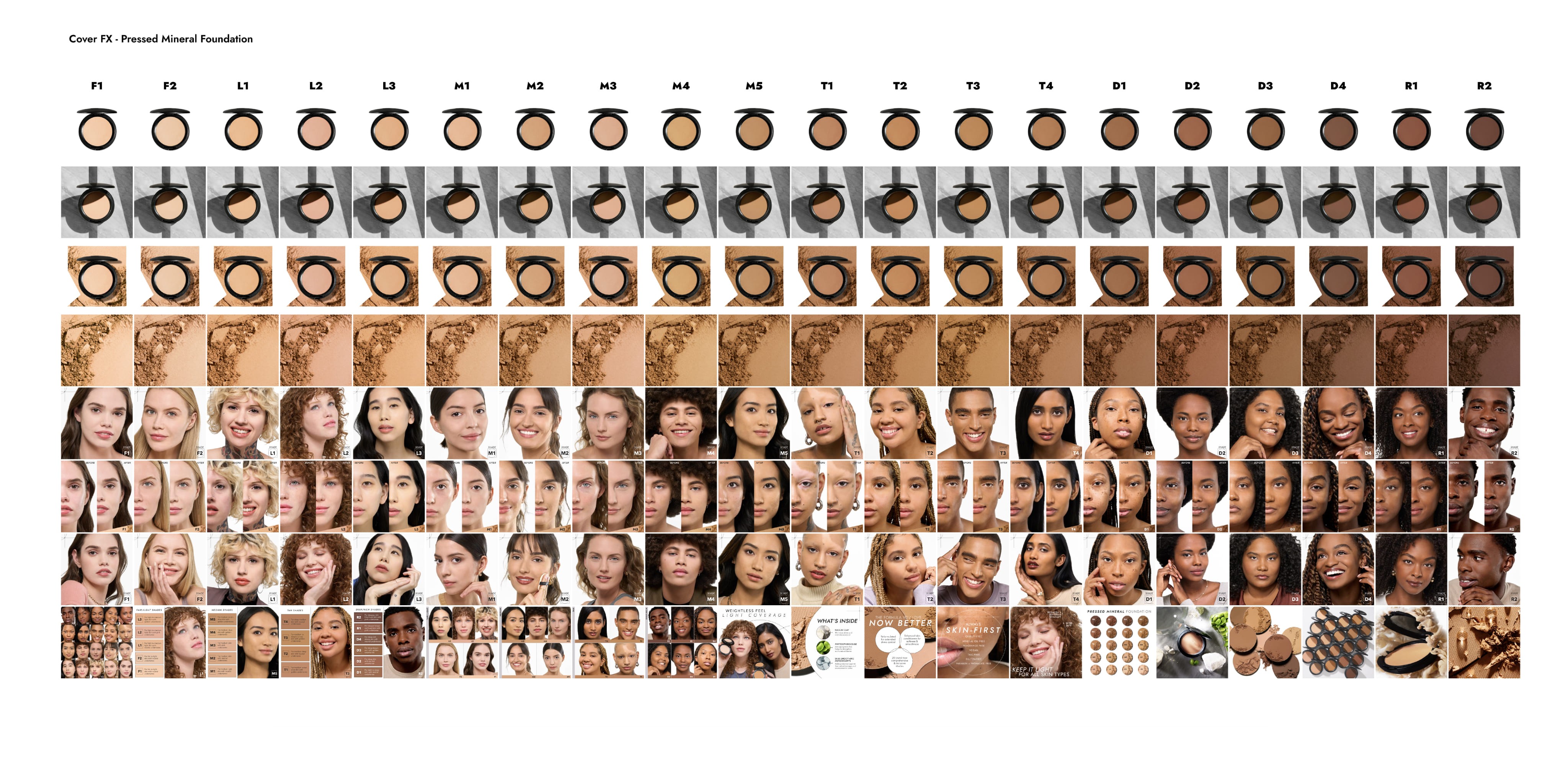
I designed every variant to have a unique experience on the page when you click through, giving each variant its own carousel or images highlighting complete looks, before and afters, model charts, and more. Below the fold, I designed several modules to assist in shade finding, product performance, and usage education. These enhanced content zones offer a satisfying deep dive for the customer!
PDP Imagery
PDP images were curated to be unique per variant selection. As customers select a shade, multiple images can help confirm a successful shade match and/or prompt the customer to choose another. Along with textures, I included full model lineup charts, tone-specific charts, before and afters, product benefits, and lifestyle imagery to aid in the buying decision.
PDP Design for Kits
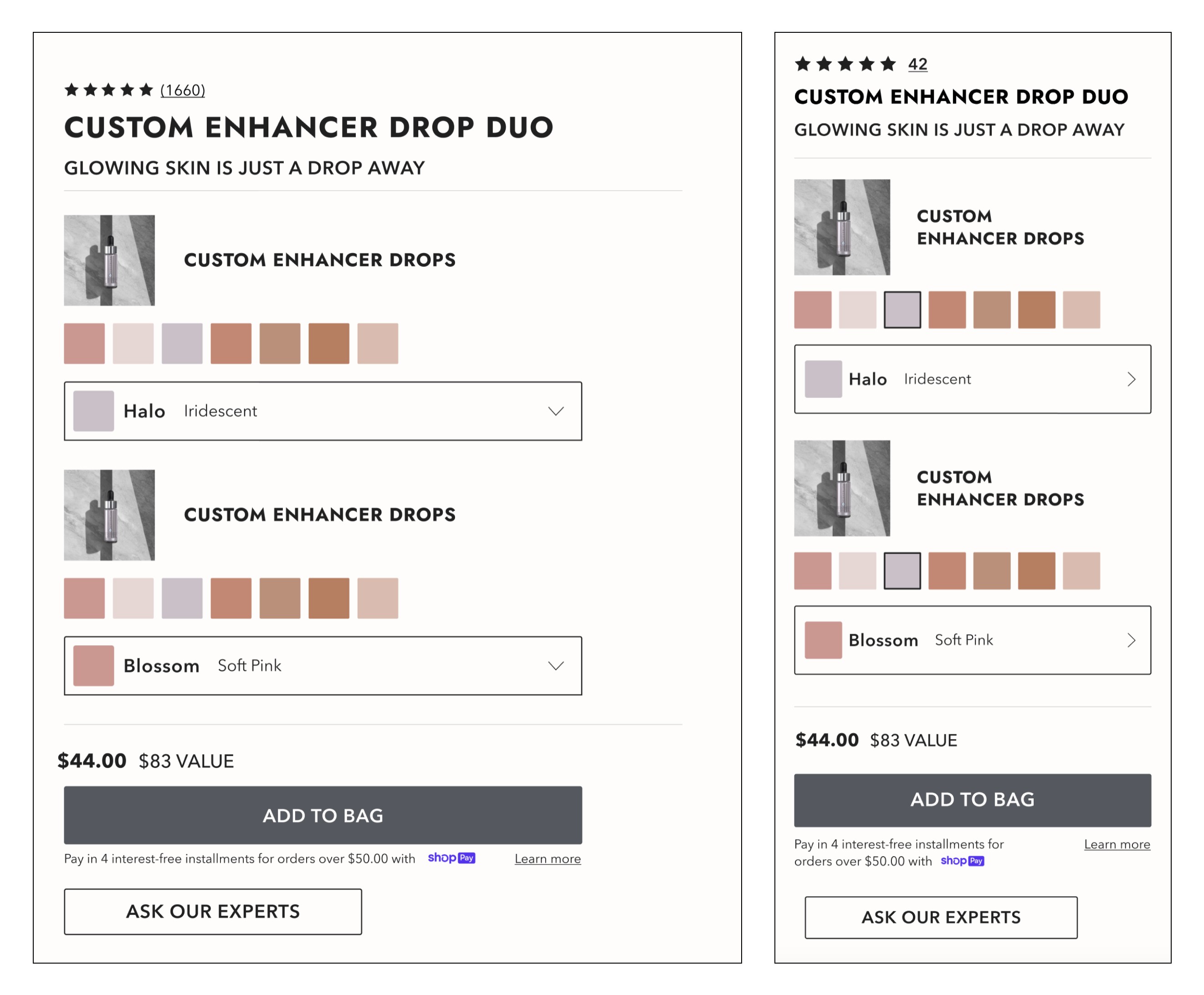
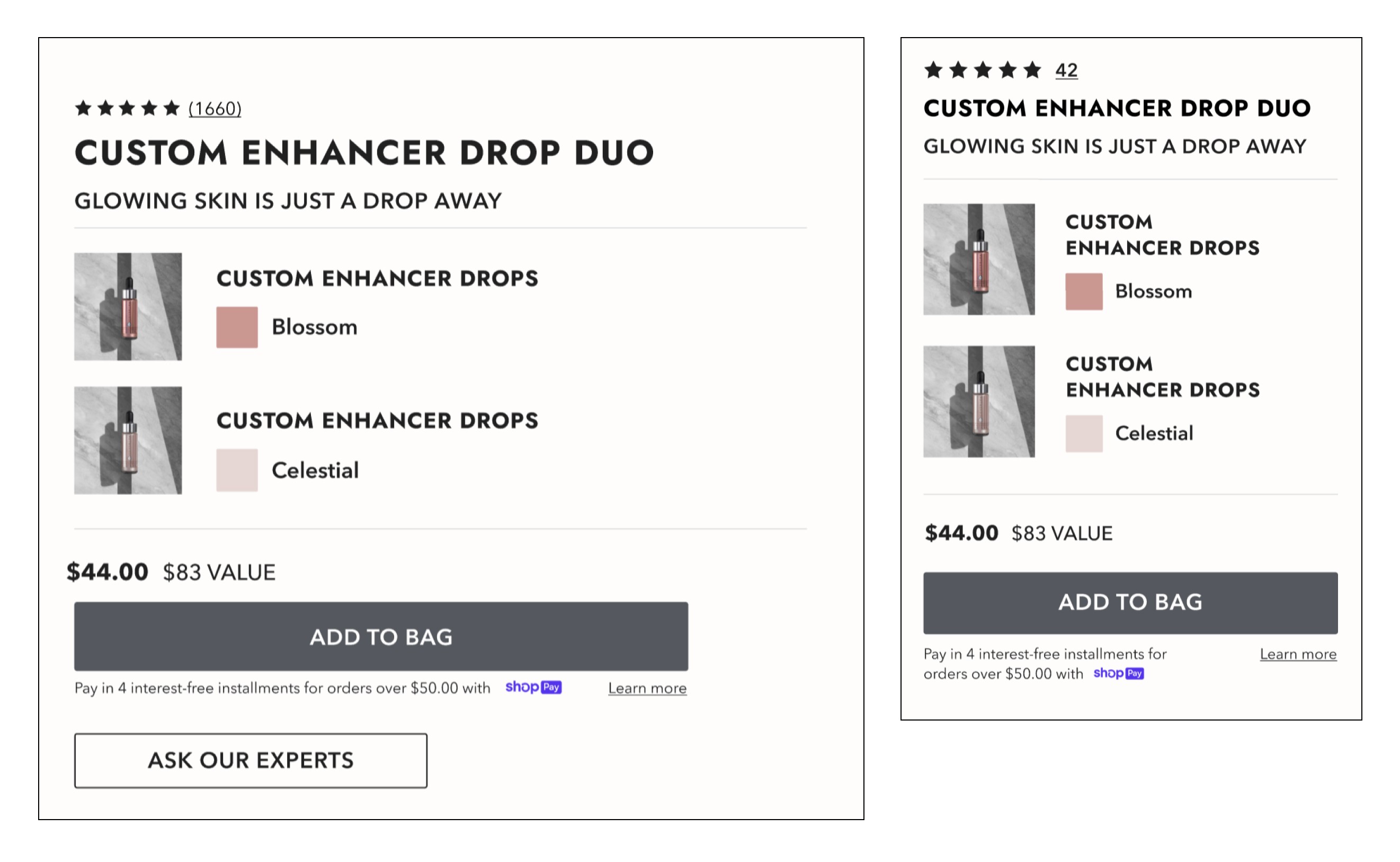
Kits with Shade Selection
Kits are a major revenue driver of the Cover FX business. I created their PDP design for multiple scenarios. In this case, the customer can choose any shade available to make their own custom kit!
Kits with Predetermined Shades
Cover FX also develops pre-curated kits to account for inventory concerns, different looks, and instant routines. Here's an additional example for a curated kit where the customer cannot select shades.
Shade Finding Solutions
One of the single hardest challenges in DTC beauty is ensuring customers find the right foundation shade. As the brand moved away from a brick-and-mortar presence, customers were unable to physically try-on shades or approach a store associate for help in-person. I created these solutions to give the customer as much help as possible on the spot.
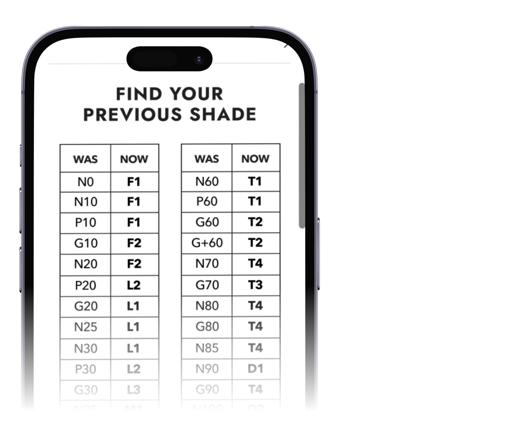
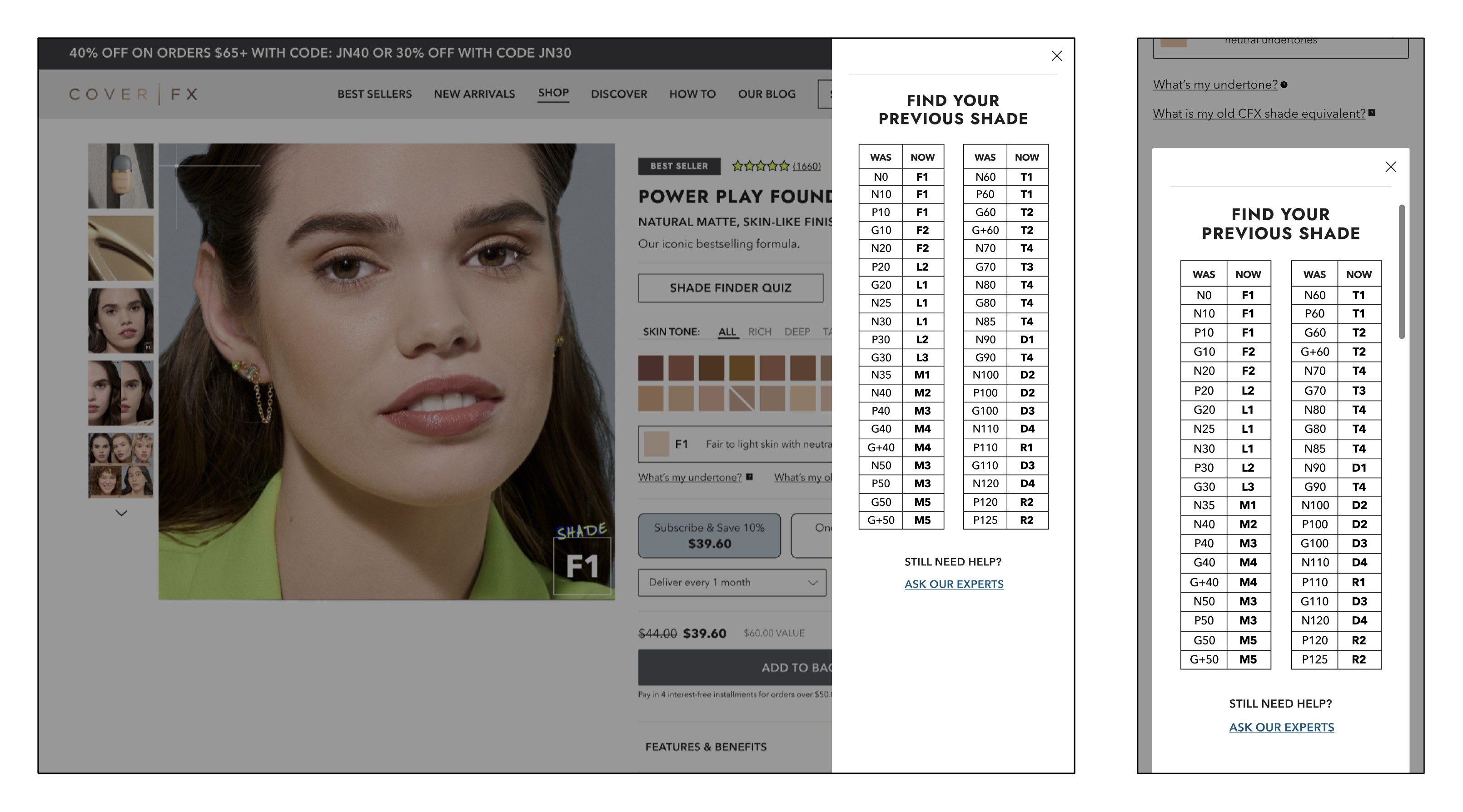
Finding Your Previous Shade
With the larger Cover FX rebrand came a repositioning of many previous products, including renaming the foundation shade range. With recommendations from our Product Development team, I built an easy-to-follow shade chart for returning customers to quickly find a new shade that would work for them based on previous purchases.
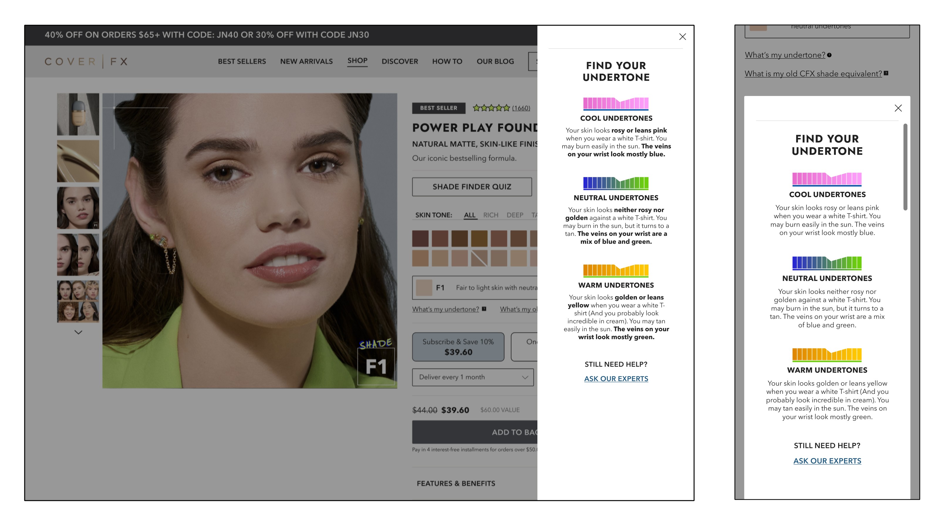
Finding Your Undertone
With the larger Cover FX rebrand came a repositioning of many previous products, including renaming the foundation shade range. With recommendations from our Product Development team, I built an easy-to-follow shade chart for returning customers to quickly find a new shade that would work for them based on previous purchases.
The Product Listing Page
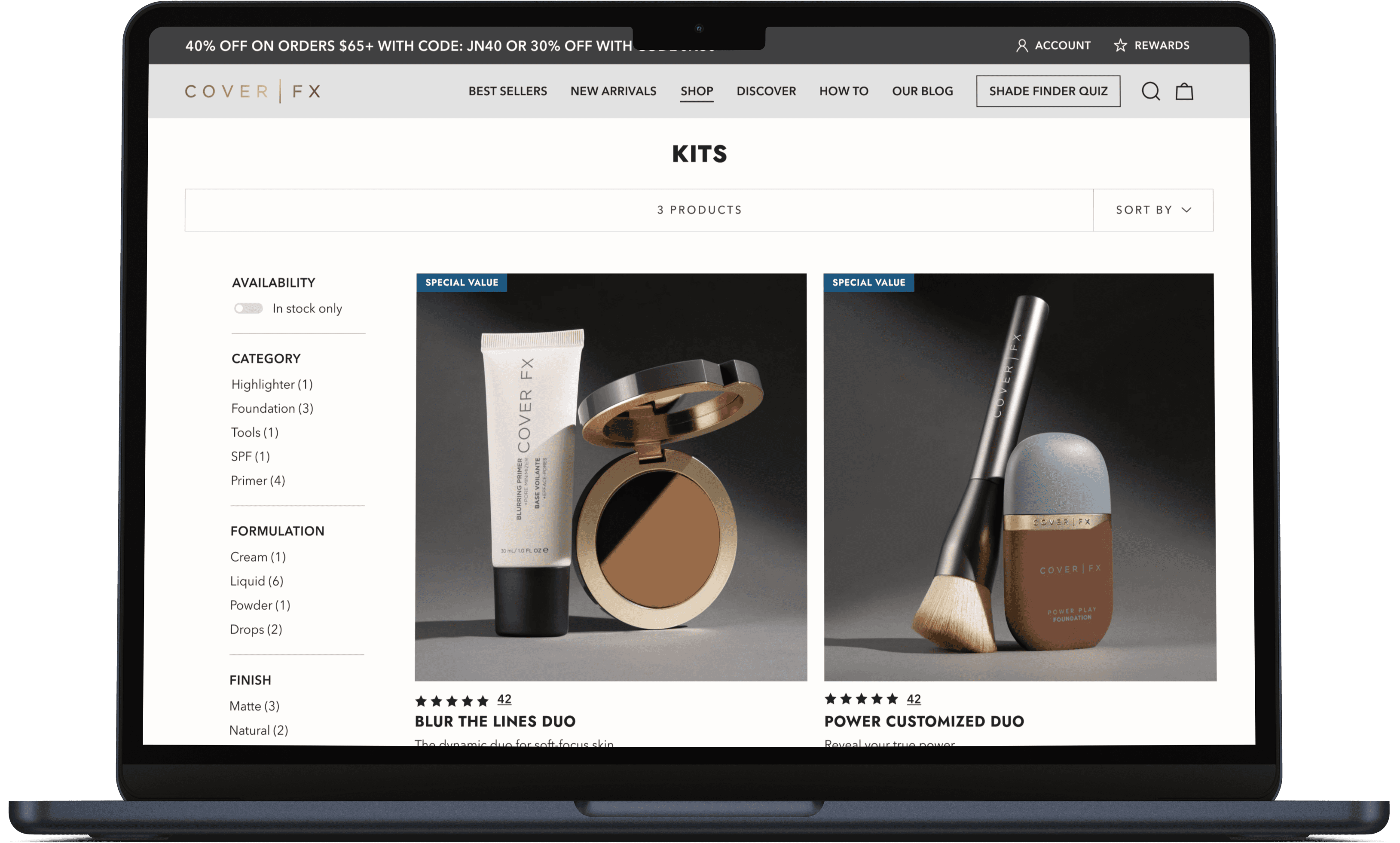
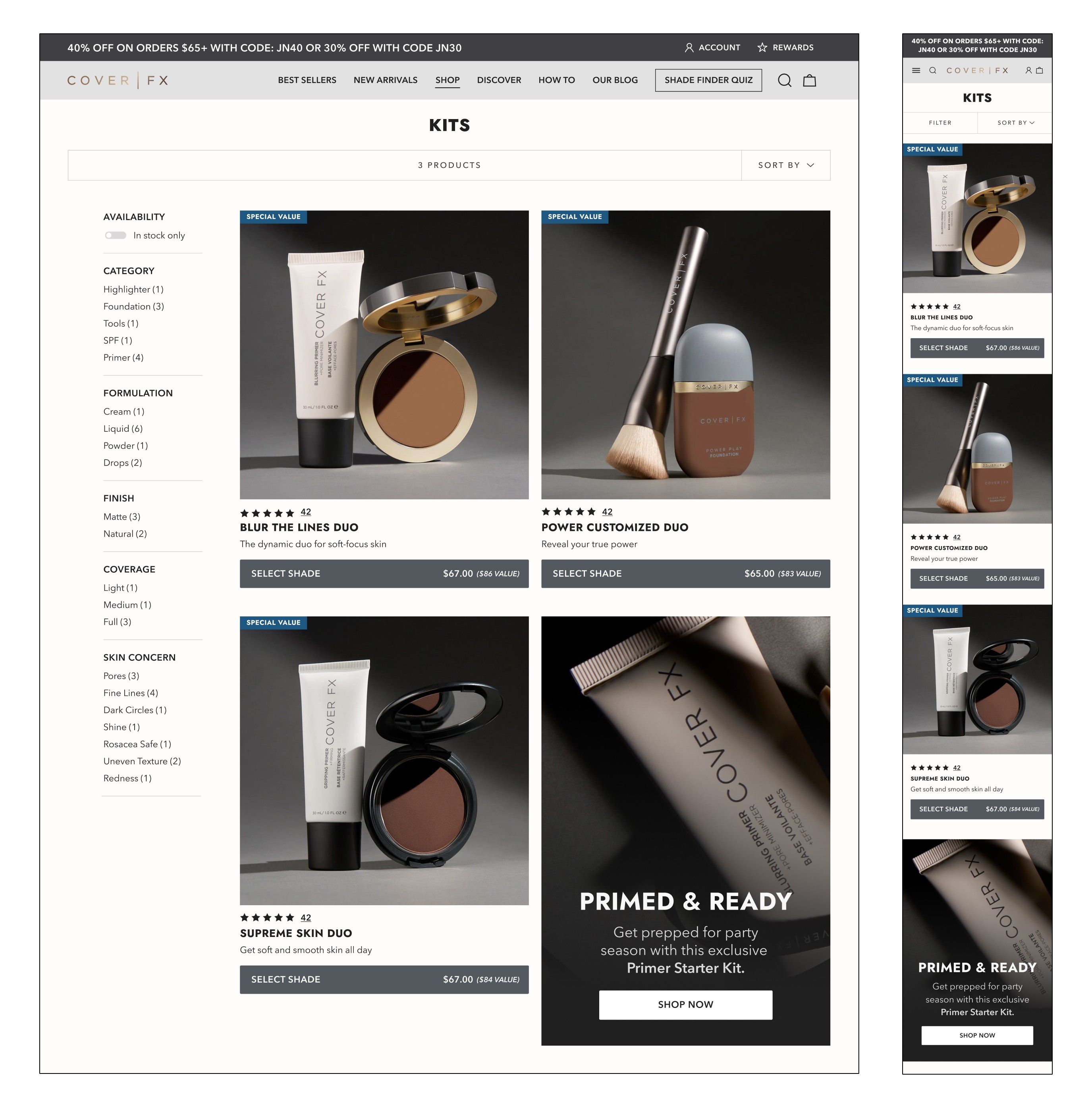
I included this filter on the left hand side of the PLP to ensure customers can rapidly find exactly what they're looking for. Our research data suggested this customer was very makeup savvy, so we wanted to help them target their desired product quickly. I also included a functionality to sort by skin concerns, so customers could pinpoint specific problem areas.
This PLP was designed to be shoppable from the get-go. Customers are able to select a shade and add to bag straight from here if they choose!

